Some things I wrote...

My Blog

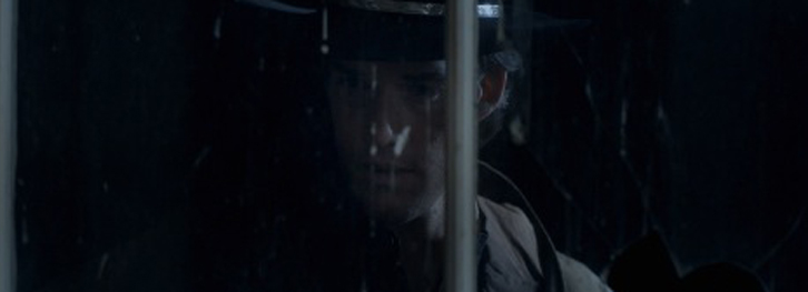
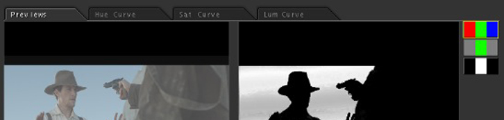
Colorist Tip #37 – Limiting Keys
Use windows to limit keys to a specific are of an image so they don't pick up similar colors in another part of the frame. Example - Key a sky to make it more vivid, but someone is wearing blue. Use a vignette across the top to limit to the...
continue reading
Colorist Tip #36 – Face Windows
Use soft circle windows to brighten up or darken faces as needed, especially to compensate for dark or aggressive looks. Face windows/vignettes are very common in coloring, and can be a great tool in your workflow. This may seems like a pretty elementary tip, but it's something to consider when...
continue reading
Colorist Tip #35 – Selection Views
In Apple Color secondaries, there are three views for window or key selections - the final output, isolated color, & the matte. The matte view is probably the most useful of these for fine tuning keys because you can see noise, spots, etc. When finessing or viewing a key (or...
continue reading
Colorist Tip #34 – Tolerance & Blur
Key Tolerance vs. Key Blur - Tolerance ramps down the colors that are keyed instead of a hard stop. Blur softens the matte. Use tolerance to fine-tune a key that won't pick up something fully. Use key blur to soften noisy or hard edge keys This is best demonstrated visually....
continue reading
Colorist Tip #33 – Qualifiers
Don't just rely on the eyedropper to pull your keys. usually it'll do a pretty crappy job. be sure to hit those qualifiers! Qualifiers are the hue, saturation and luminance sliders that let you fine-tune keys with tolerance, softness etc. Here's an example of a key I pulled using just...
continue reading