
Hi! I'm Aaron
Creative Director + Motion Graphics Artist + Colorist + Editor
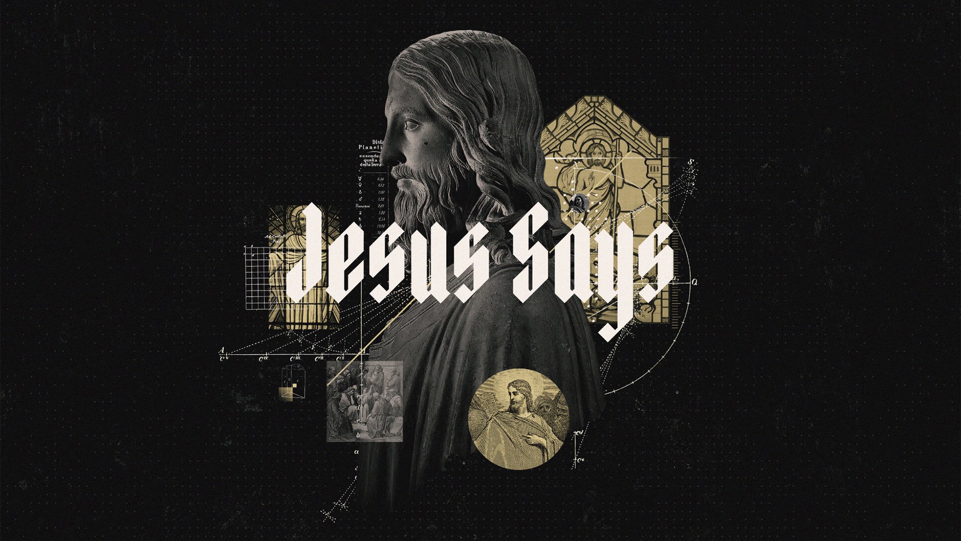 Jesus Says
Creative Direction
 Christmas at Connection Pointe
Creative Direction • Motion Graphics
 Kingdom
Creative Direction
 Words of Comfort
Creative Direction
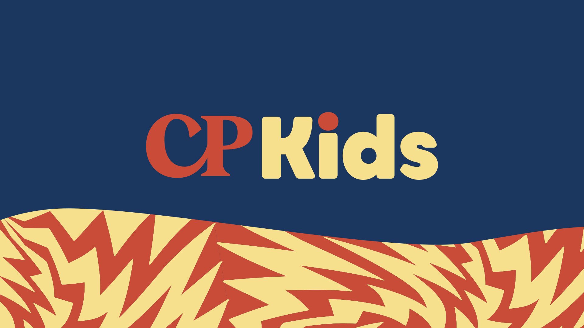 CP Kids Rebrand
Creative Direction
 Christmas at Connection Pointe
Creative Direction • Color Grading • Video
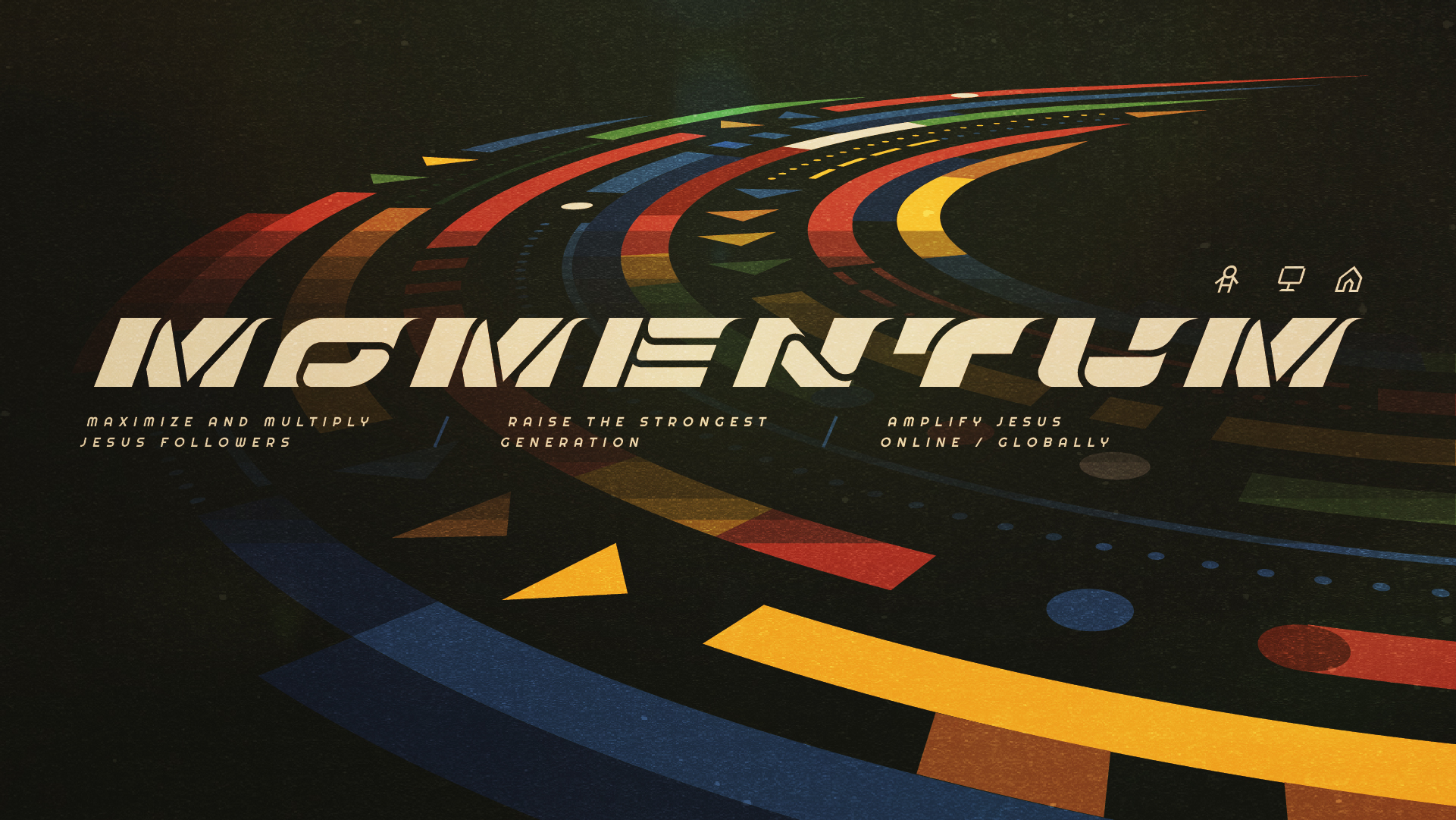 Momentum
Creative Direction • Environmental
 Welcome Home
Creative Direction
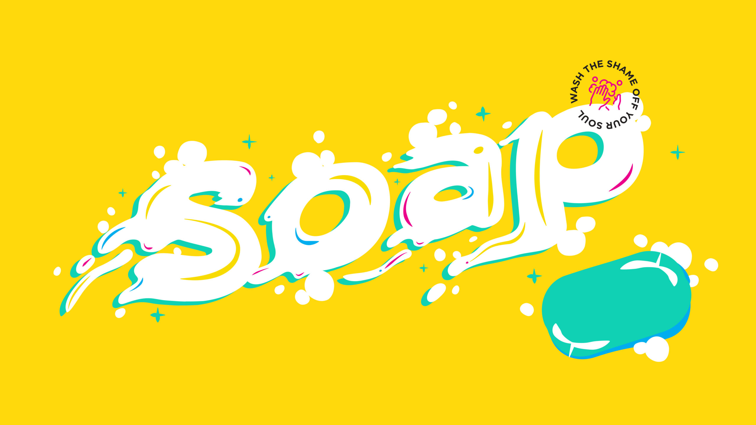 SOAP
SOAPCreative Direction
 The Real God
Creative Direction
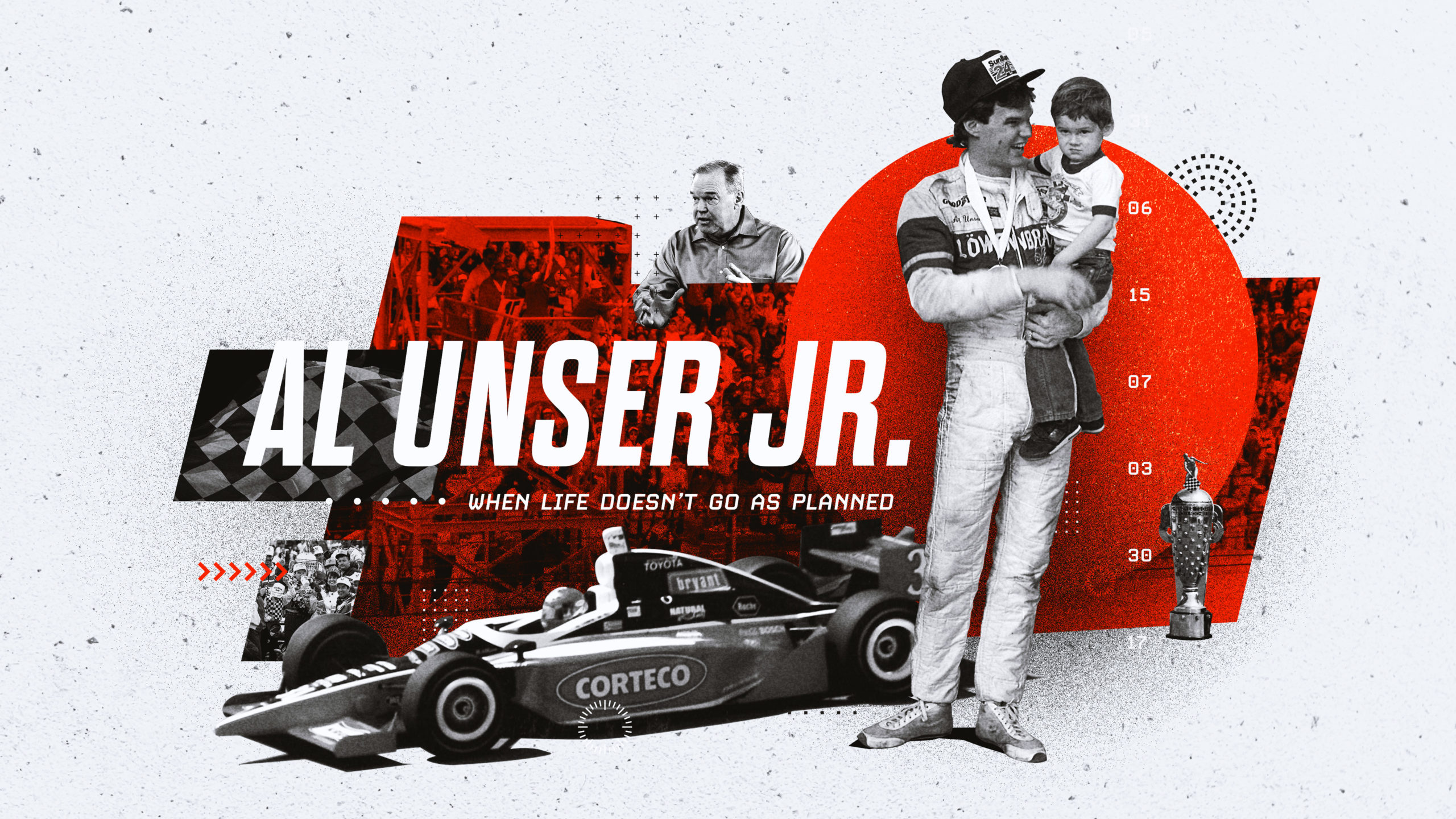 Al Unser Jr.
Creative Direction • Video
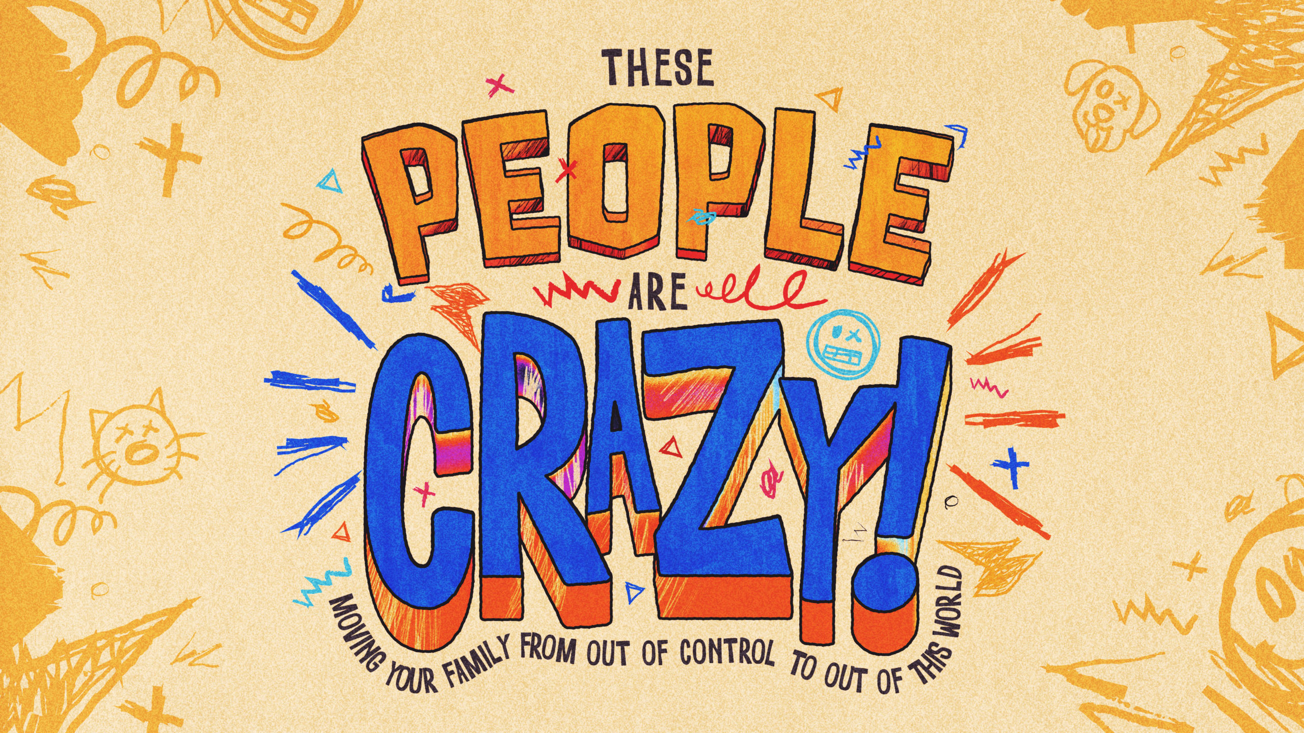 These People Are Crazy!
Creative Direction
 Zach Williams: Fear is a Liar
Motion Graphics
 Lindsey Bryant: Get Down & Giddy Up
Color Grading
 Yuletide Festival
Creative Direction
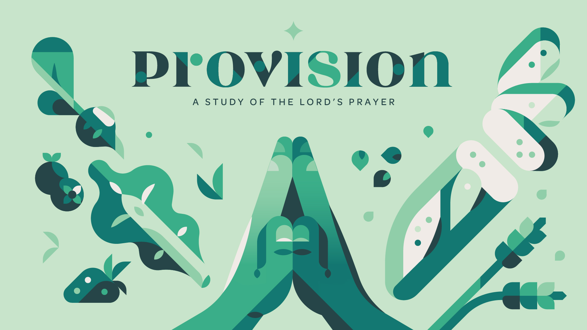 Provision
Creative Direction
 Connection Pointe Family Conference
Creative Direction
 Easter at Connection Pointe
Creative Direction
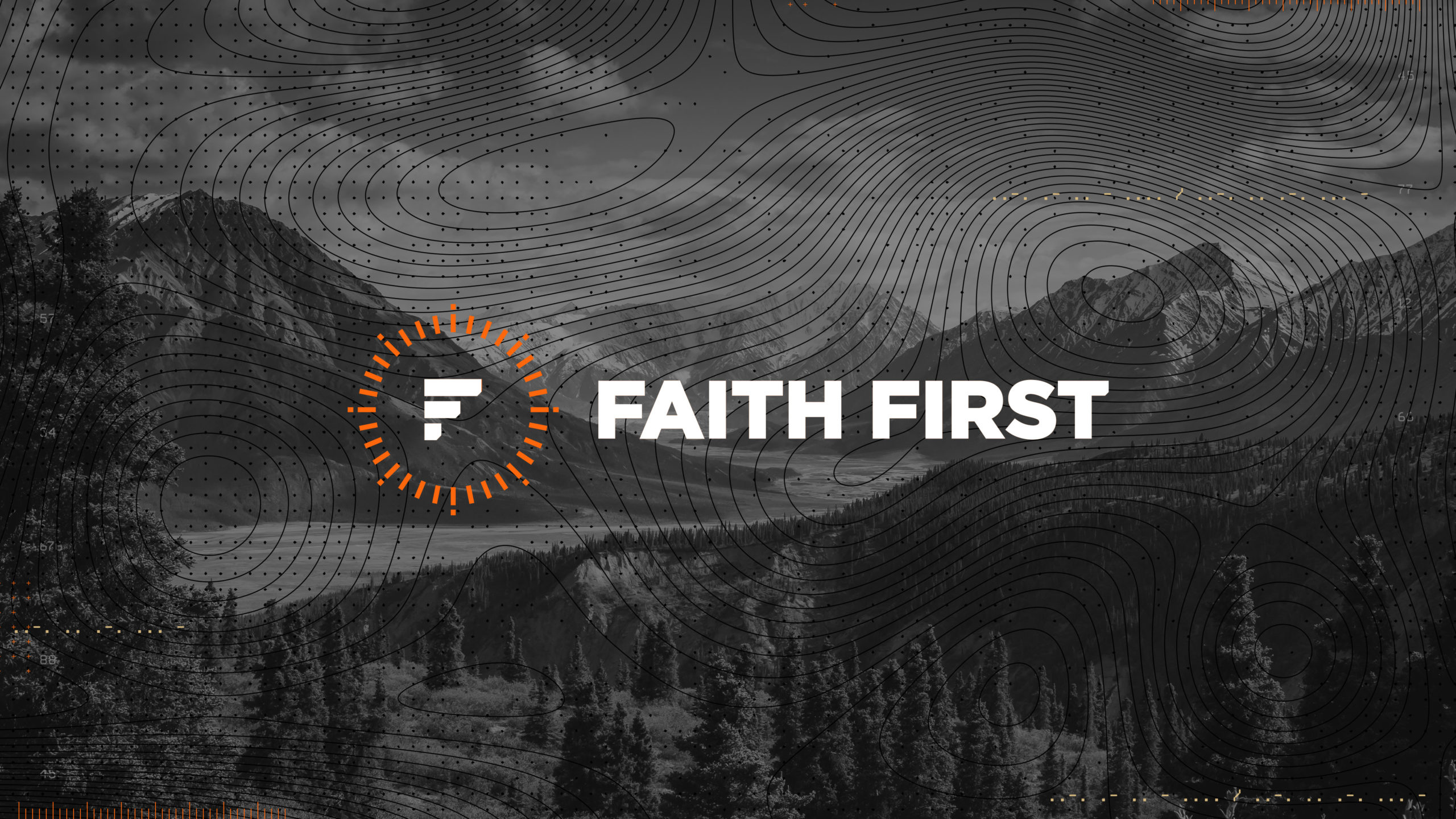 Faith First
Creative Direction
 Jesus Loves Me
Creative Direction
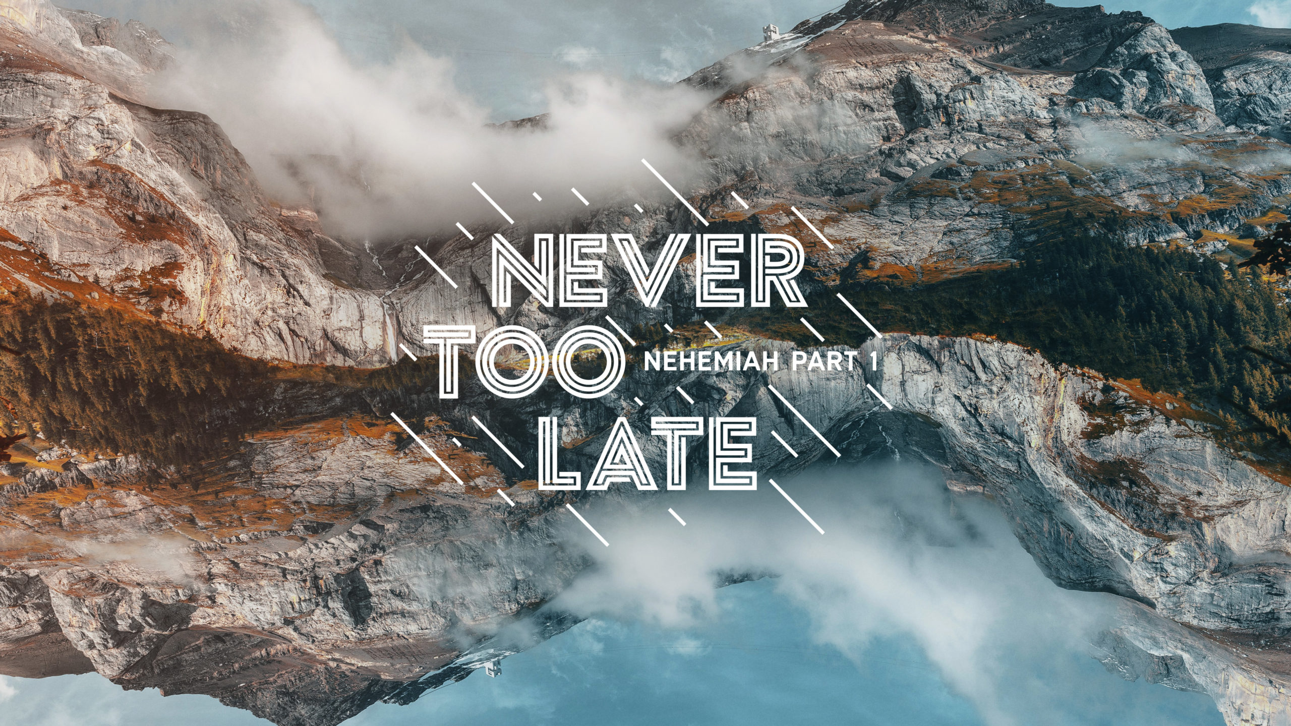 Never Too Late
Creative Direction • Editing • Motion Graphics
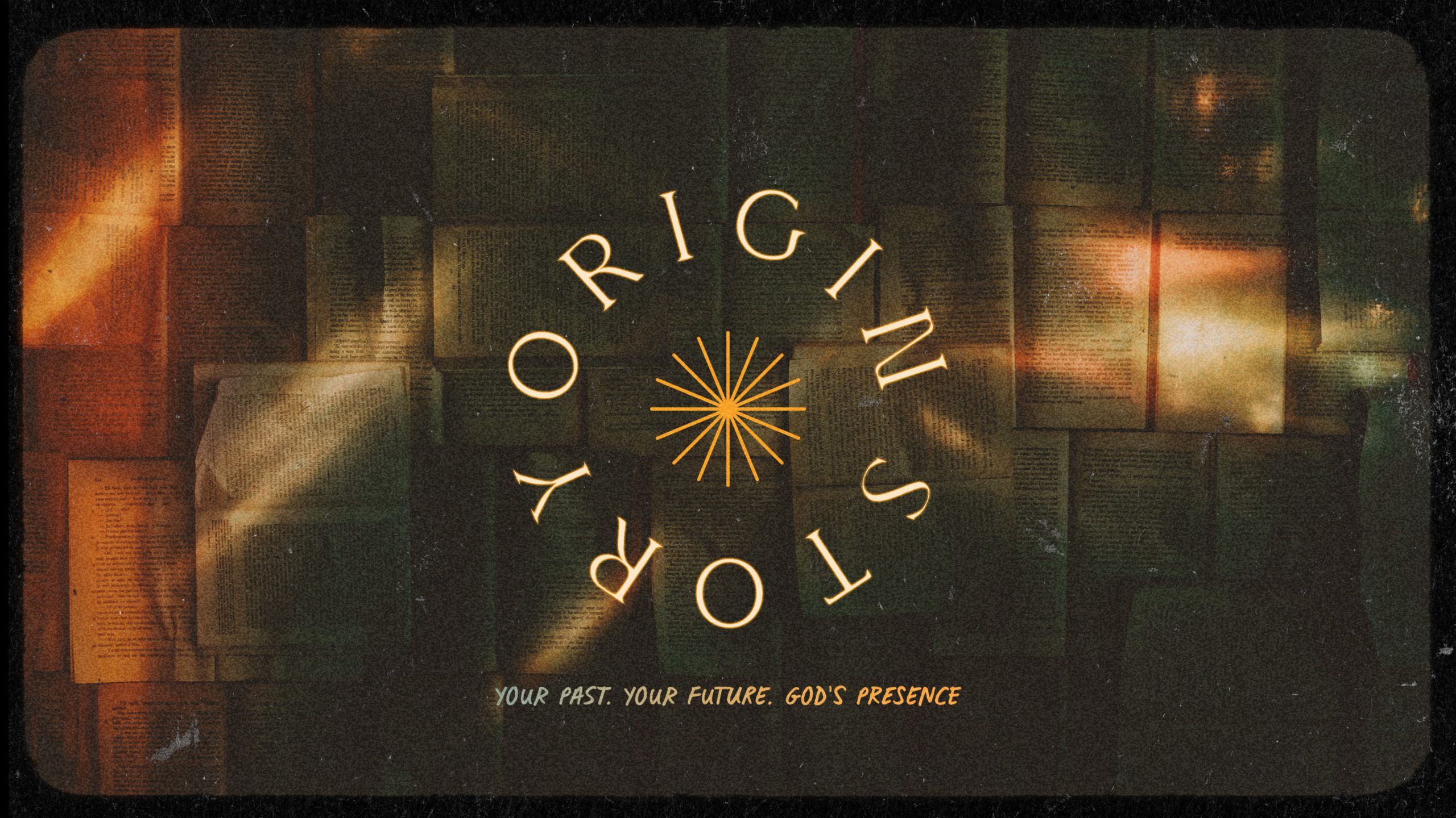 Origin Story
Creative Direction • Environmental
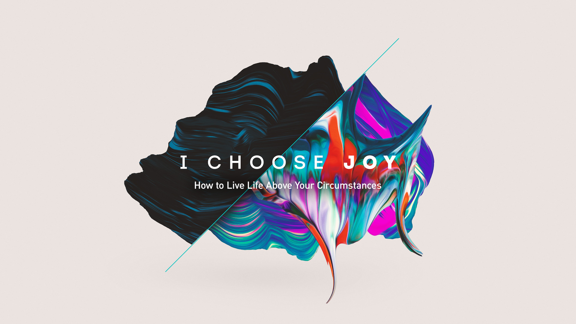 I Choose…
Creative Direction