Some things I wrote...

My Blog

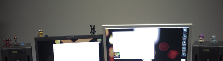
Colorist Tip #42 – Wall Color
When setting up your coloring environment, try to pick a neutral wall color (like a 50% gray) to manage color influences. For my office, I used a photo gray card to match the color. When coloring, you want to be aware of what colors your eyes can see (even in...
continue reading
Colorist Tip #41 – Luma Curve
While the Luminance Curve doesn't have as many practical uses as the others, it is particularly good at sky adjustments. To darken or add contrast to a sky, it works a little better than a key because you can build in smoother tolerances. In my experience, I don't use the...
continue reading
Colorist Tip #40 – The Hue Curve
The "Hue Curve" in Apple Color works like the Sat. Curve, but shifts the hue of the selected color based on your points instead. The Hue Curve is actually great for emulating old stock, like a two-strip process. Just like the Saturation Curve, the Hue Curve works by placing control...
continue reading
Colorist Tip #39 – Sat. Curve
The saturation curve lets you adjust saturation for a range of hues using control points. Isolate the hue, then pull up/down. It's particularly useful for affecting multiple colors/hues in a single secondary. The best way to describe how this works is to show you: The saturation curve work by using...
continue reading
Colorist Tip #38 – Work “Outside”
Want to affect everything but something? Key or put a window on what you don't want, then work "outside" your selection. In Resolve, make a new "outside" node. In Apple Color change this drop down: I used this technique to make my "desaturation vignette" in this post, but you can...
continue reading