Some things I wrote...

My Blog

The “Classy” Look
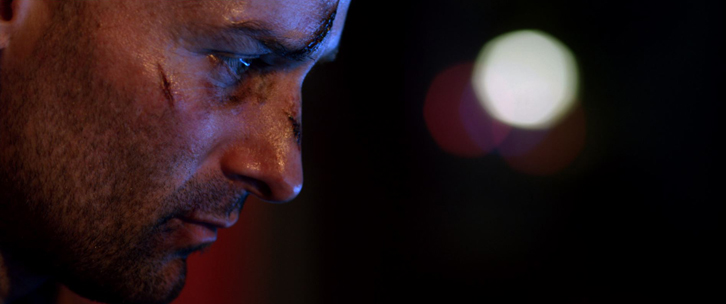
Okay, I'm terrible at naming my looks, but here's a breakdown of a look I did for a TV commercial I finished last month. I was wanting to give the footage the feel of intelligence, subtlety, and class, so I went with earth tones and a lower saturation. [box type="info"]One...
continue reading
FCP, Color Grading, and the irritating gamma shift…
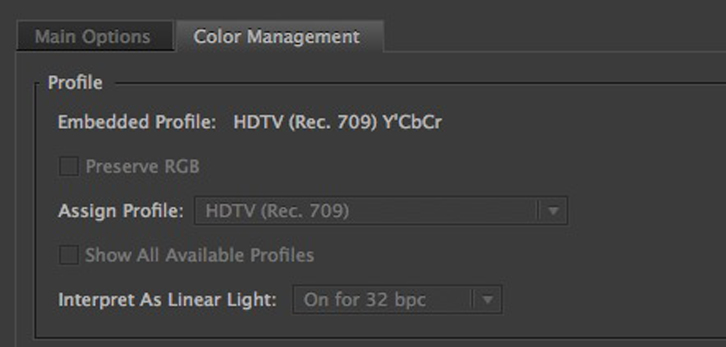
I woke up this morning with this twitter mention on my phone this morning: @videoaaron Need a 3rd opinion.Is there any way to properly stop gamma and colours changing when you export from FCP?Any plugin etc? TY! — Jonny Jones (@MrJonnyJones) April 18, 2012 I remembered encountering this a few...
continue reading
Freebie – Ink Drops
I dabble in a few other things besides color grading: editing, motion graphics, vfx, etc. In working on a recent project, I realized I needed some ink drop elements, and sadly my Video Copilot collection just didn't quite have what I needed for this specific look. Being the thrifty individual...
continue reading
My Thoughts on FCPx
I've had a few people ask me about my thoughts on the new Final Cut Pro, so I though I'd have a crack at it to join in with all the others. My perspective might be a bit different: I don't work in a post-house and my workflow isn't really...
continue reading
Colorist Tip #46 – Preparing Looks
Well, today's tip will be this site's first Guest Post! Rob tweeted a great colorist tip the other day, so I thought I'd see if he'd like to expand it a bit for the site. Rob's a great colorist based in Boston, and a great help on twitter as well!...
continue reading