
A couple weeks ago I graded a submission to Doritos “Crash The Super Bowl” contest created by my friend from college, Josh Goldman. It’s a funny and well done spot, and he’s graciously allowed me to do a series breaking down the grade. First up, watch the final graded piece (switch it to 1080p for sure; it was shot on a Red EPIC and mastered in 4K!):
On a side note, if you like it and want to rate/vote for it, you can do so here. It’d be pretty cool to say I graded a commercial that aired during The Super Bowl.
This breakdown series is going to be a little different. I’m not going to go into tremendous detail of every step, mainly because the grade was very specific to the footage, and not a general “look”. Instead, I’m going to take a cue from one of my new favorite blogs, I See Hue, and do a higher level breakdown so you can see the thought that went into tweaking the shots. Here’s the video breakdown:
The Breakdown:
Raw: The raw footage comes from a Red EPIC, shot at 5K. I graded in Redlog since I would be getting several DPX sequences from his VFX artist included in the project, and that was the setting he used inside Nuke.
Primary balance: This is the initial correction, adjusting gamma and white balance to get a natural look.
Brighten the bag: This pass raised the exposure on the bag, since I wanted it to stand out from the rest of the shot, and it was looking a little dark. I used a rectangular window for this:
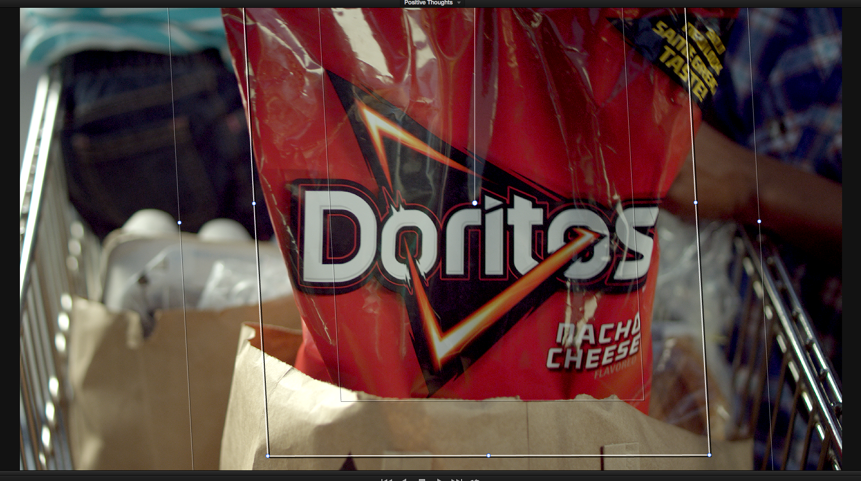
I ended up not having to track this window.
Desaturate the blue shirt: The blue in the kid on the right’s shirt was a little too saturated for my eyes, so I used a hue vs. sat curve to knock it down a bit:
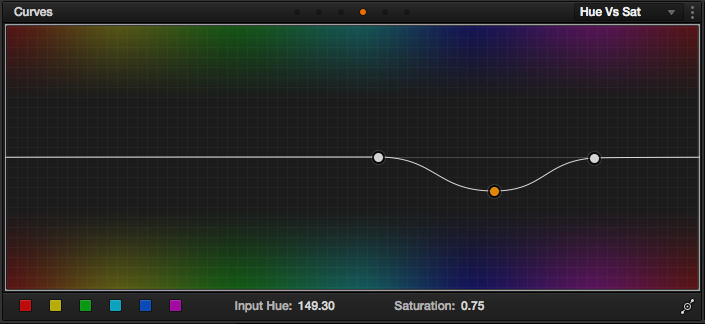
I just dropped the blue/indigo saturation.
Brighten the whites: After looking at it, the shot still felt a little dark, so I brightened up the whites of the entire shot to better match the wide shot after this one.
Correct the bag color: The red of the bag just didn’t match the real thing well enough, so I pulled a key to bring that red closer to the Doritos’ brand. The Bag and the chip color where very important throughout this whole process:
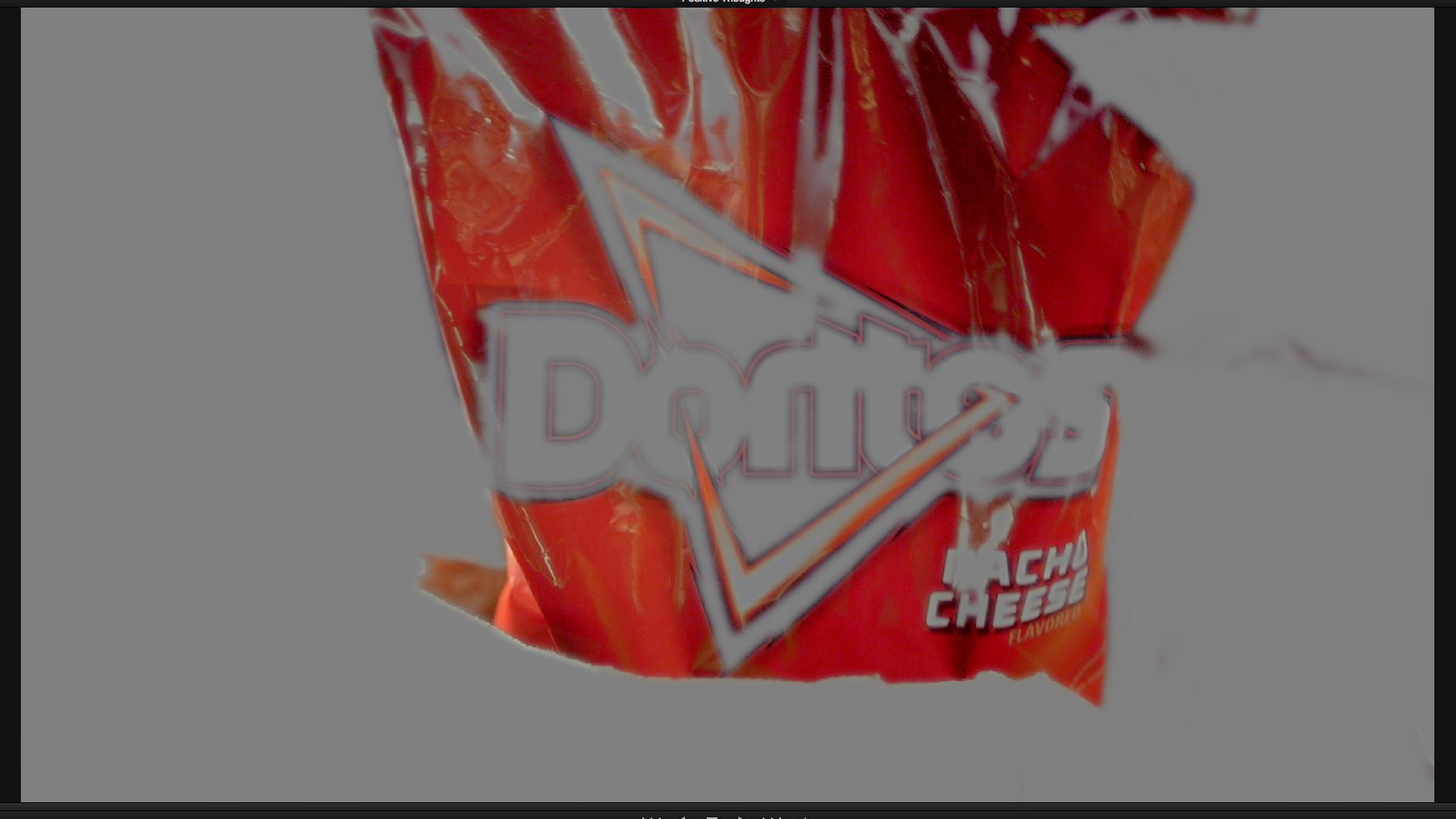
Here’s the rough key I pulled on the bag, which worked well for the short shot.
Sharpen the bag: At the suggestion of Dan Moran (a super badass colorist I know from twitter), I added some sharpening to the bag to really make it pop. I limited the effect to just the bag using a tracked window:

This mask was tracked to stay with the bag, since I didn’t want anything else sharpened.
Apply the look: Here’s the “look”, which is actually a very subtle “blockbuster” look, mostly emphasizing the warm highlights with less cool tone in the shadows:

A very subtle look compared to most commercials, but this was at the direction of the director.
Add a vignette: I added a subtle vignette consistently across the piece:

Here’s the size and shape of the window I used.
Lower contrast: My first pass had a pretty good amount of saturation and contrast, but the director wanted it to be “softer” without losing the vivid colors. After thinking this over a little and talking with a few other colorists, I lowered the contrast using curves:
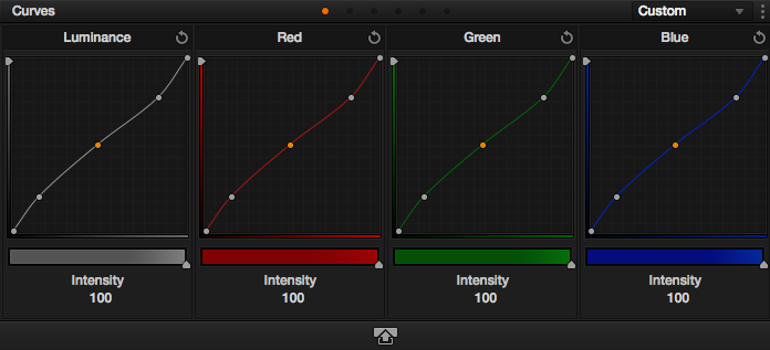
An inverted “S” curve to lower contrast.
I hope you enjoyed the breakdown of the first shot! I’ll be going through the entire spot shot-by-shot as I had several issues to tackle. Shot #2 is coming next week!


11/25/2013, 6:55 pm
What technique did you use for the sharpen of the bag?
11/25/2013, 10:29 pm
It’s pretty simple: just a tracked window to limit the effect to the bag, and a low radius sharpen using the built in sharpness effect panel in Resolve.
01/06/2014, 10:53 am
Nicely done Aaron! I’m glad to see that my breakdowns are inspiring others to do the same, good job :)
07/01/2014, 6:46 am
Love these breakdowns! Great insight and easy to follow the “process” Top work Aaron!
03/16/2015, 2:39 pm
03/20/2015, 11:01 am