
Well, it didn’t make it to the semi-finals, but it did get a ton of views, so thanks! We’re going to keep trucking along with the shot breakdown series anyway, because there’s some fun stuff in there. Here’s the breakdown for shot 2:
The Breakdown:
Raw: The raw footage comes from a Red EPIC, shot at 5K. I graded in Redlog since I would be getting several DPX sequences from his VFX artist included in the project, and that was the setting he used inside Nuke.
Primary balance: This is the initial correction, adjusting gamma and white balance to get a natural look.
Lower Car Exposure: After the primary balance, I noticed that the back of the SUV was a little overexposed. A simple window and lowering of the highlights brought back down to a more natural exposure. Still bright compared to the subject, but not overexposed.

Here’s the window I used for the car exposure. This is why I love Red and Log :)
Correct the bag color: Again, the Bag and the chip color where very important throughout this whole process. The red of the bag just didn’t match the real thing well enough, so I pulled a key to bring that red closer to the Doritos’ brand, and limited it with a tracked window:

This window did get tracked to the bag as it rose.
You’ll notice that I didn’t do a sharpening pass on this shot for the bag. Since the bag is out of focus, and passes over the head of the kid, it was far more noticeable on the kid than the bag. It didn’t really add anything to the shot like it does in the others.
Apply the look: Again. here’s the “look” used throughput the piece, which is actually a very subtle “blockbuster” look, mostly emphasizing the warm highlights with less cool tone in the shadows:

A very subtle look compared to most commercials, but this was at the direction of the director.
Add a vignette: I added the same subtle vignette consistently across the piece, just like in the shot before.
Lower contrast: Here’s the “softening” pass I added to the whole spot at the director’s request. I used curves to lower the contrast and make it a little less punchy:
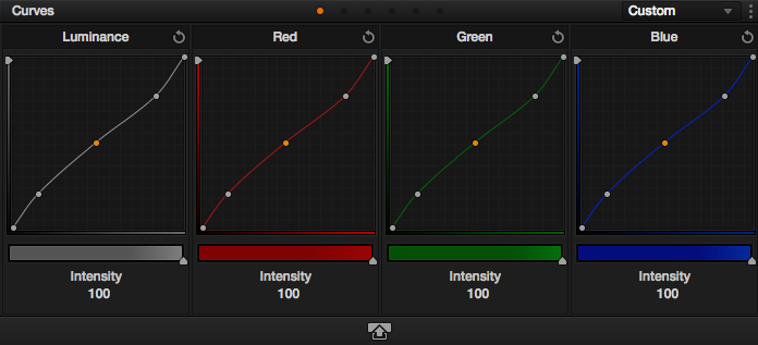
An inverted “S” curve to lower contrast.
Sorry this shot was a little late, but I’m going to try to get the other up at a rapid fire pace. Look for Shot #3 before the end of the week!


03/16/2015, 2:40 pm