
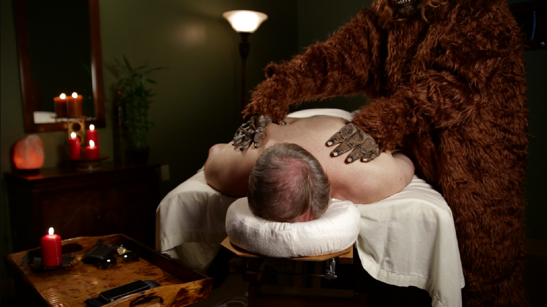
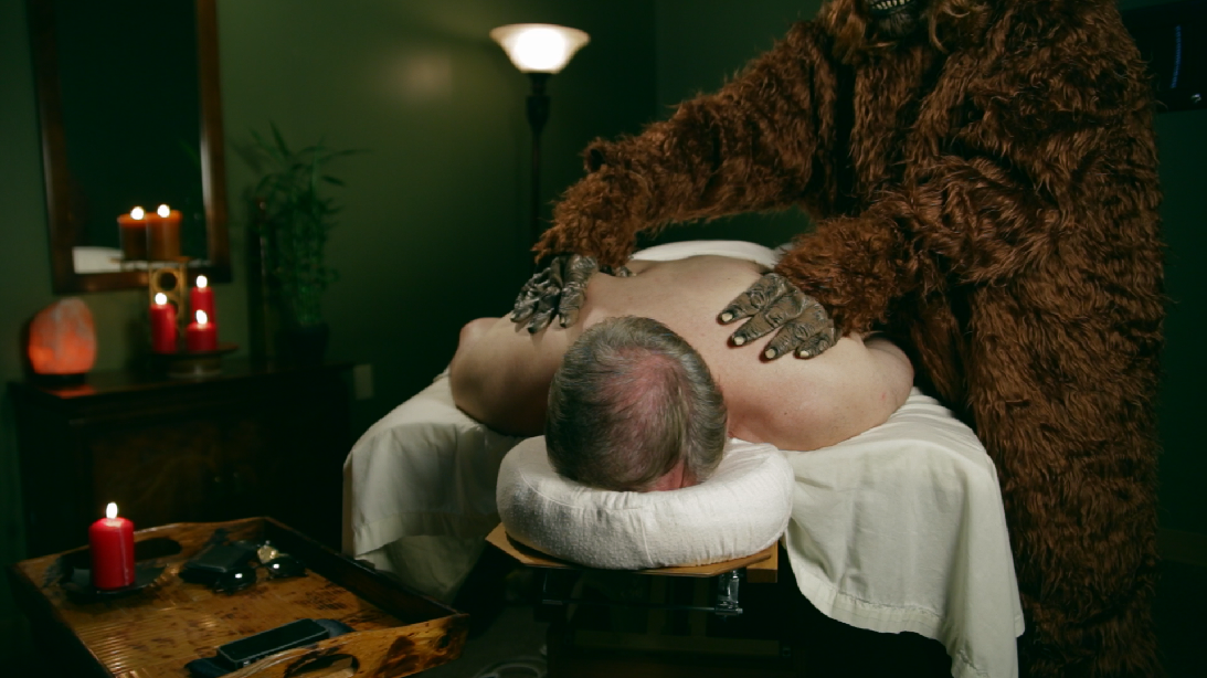
For part 3 of this vintage looks series, we’re going to look at a cross-processed look. A quick Google search of “cross process” gets the general idea across: green shadows, red or yellow midtones/highlights. We’re not going to to quite as extreme as these reference images, but the basis is there. We’ll start with this image:

The balanced base image
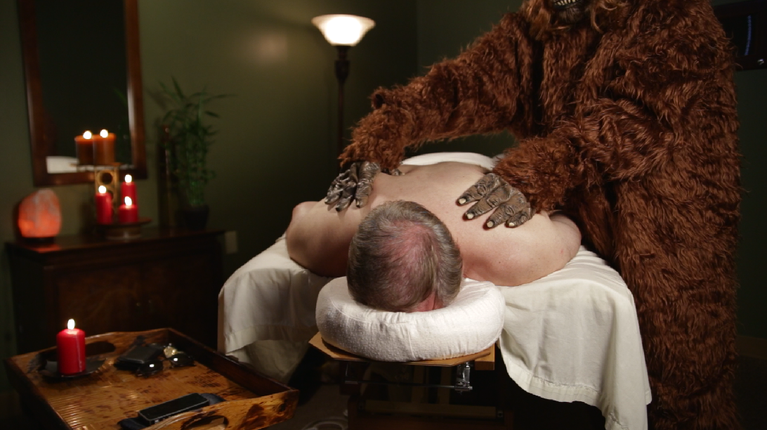
Our first step is to really darken this shot. We’ll start by lowering the mids a good bit:
Start to darken the shot

Gamma first.
We want to keep a little of the shadow detail though, so we’ll raise the blacks a little:
Get some of that shadow detail back.
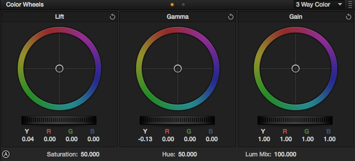
Adjustments for the above.
Now we’ll finish darkening the shot by lowering the highlights:
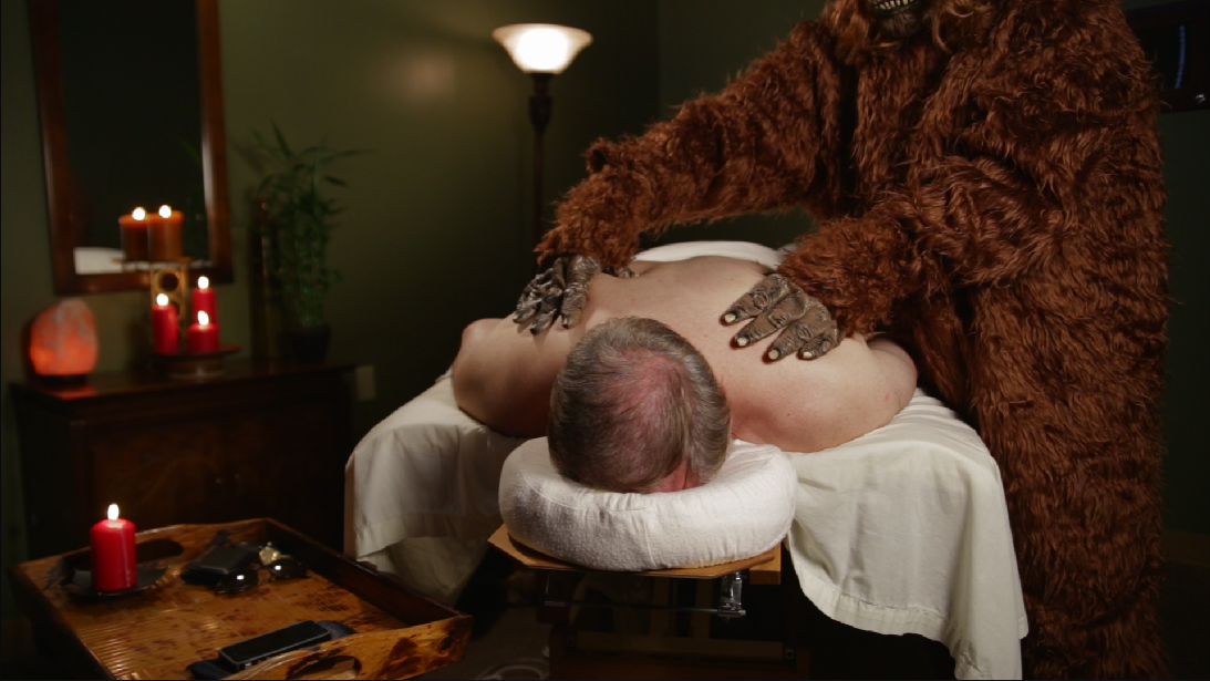
The darkness will add some good mood to the shot.

Lowering the highlights.
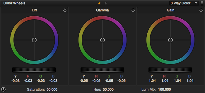
Now we’ll create a new node. With this particular look, it seemed like a good idea to separate contrast and color adjustments into separate nodes. For that cross-process look, we want to start with the green in the shadows:
Lots of green…

It’s more of a cyan-green than a yellow-green.
As you can see, our production design helped us a good bit on this particular look.
Now we’ll push some warm tones into the highlights:

This brings the skintones back into acceptable ranges.

We’re pushing an orange-red hue.
We’ll finish off the cross-process look by pushing some yellow tones into the mids:
Warm up the skintones a bit more.
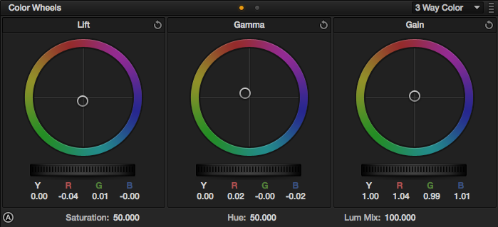
A fair amount pushed in.
Now we’ll add a new node for a vignette. It’s going to be a pretty intense vignette, and we’ll have it centered on our subject instead of centered on the shot. Here are the settings I used:
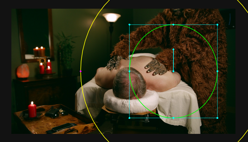
Centered on the two subjects.
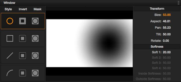
Settings for the window.
Now that we have our window set, the first ting we’ll do is darken the shadows:
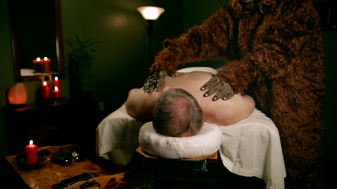
The vignette will amp up the moodiness of the shot.

Settings for the above.
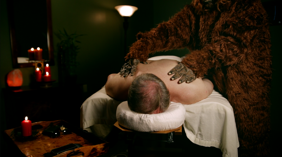
We’ll crunch the mids as well:

Even darker and moodier…

Lower the mids even more than we lowered the highlights.
We will raise the highlights a little, just so we can get a good shine from the candles on the left:
The final shot from Resolve.
Raise the highlights
Here’s the final node tree:
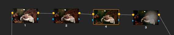
The first node is the balancing, the second is the contrast adjustments, the third is the cross process look, and the fourth is the vignette.
Worth noting: You can see by the numbering that I made the vignette node before the look. I have a habit of creating a blank vignette node pretty close to the start of the look, but not touching it until the last step. I don’t know why, it’s just a habit :)
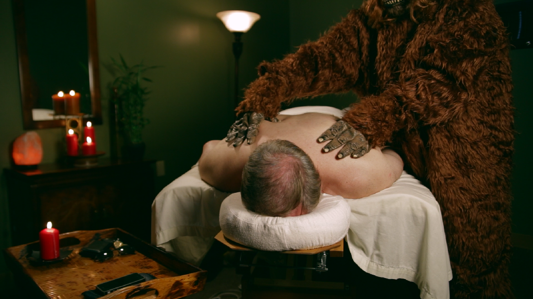
Just like the previous two looks, I brought the shot from Resolve into After Effects for letter-boxing and film grain from my Cinegrain package:

The final shot.
Attached is the Resolve PowerGrade for this look. Append it after your first node (this PowerGrade does not include the first “balancing” node in the image above), don’t forget to adjust the first node you already had to balance your specific shot. As usual, feel free to use this look in your projects all you want, but please don’t share or distribute this preset. Instead, send them here to get it.


