I worked on a piece a few weeks ago at my day job (SnapShot Interactive) that was a blast because: A.) It was pretty goofy, which was a good change of pace, and B.) It centered around a ton of vintage film looks. While I sadly can’t post the video (at least not yet), I am going to be doing a series of posts breaking down the looks I created.
The first look is going be a warm/sepia monochromatic look, featuring Bigfoot:

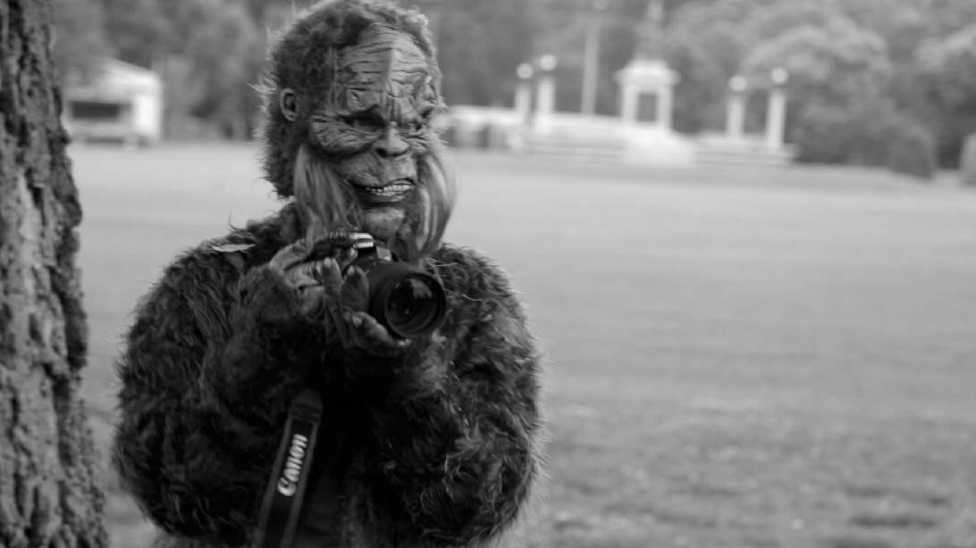
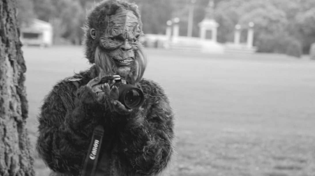
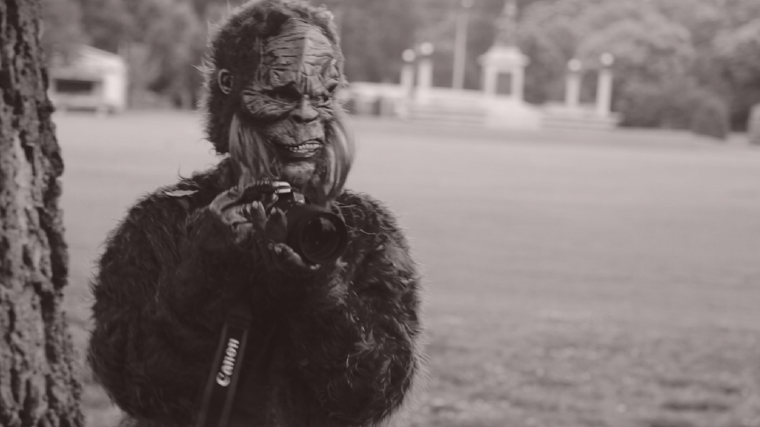
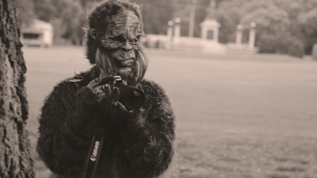
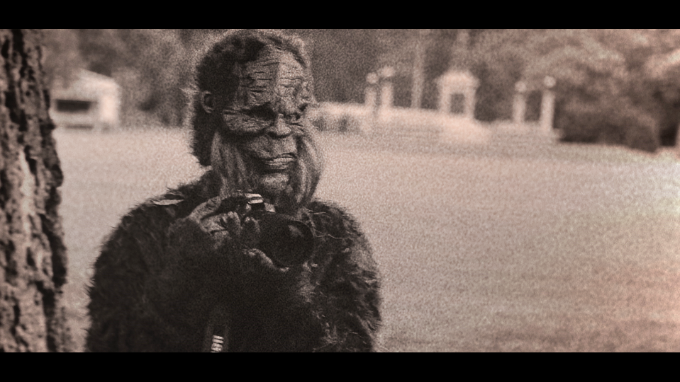
Here’s the base, balanced image.
The first thing to do (after balancing, of course) is add 2 nodes. On the second node that we added, turn the saturation down to 0:
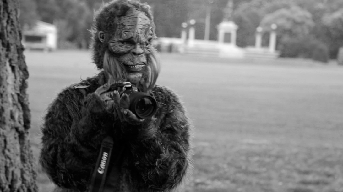
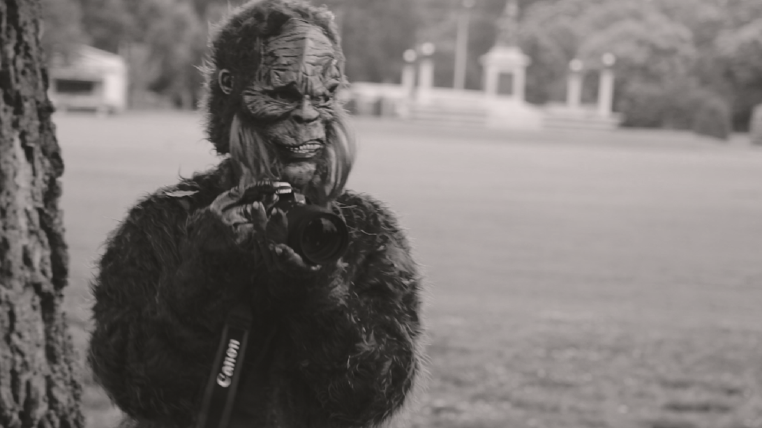
Black and white, yo.

The first step to making a black and white look is to make it…well…black and white!
Now we’ll move to the first node we added. We’re going to work underneath the desaturation we just added to give it the aged/crunched look. We’ll take advantage of the node being before the black and white to do some really crazy stuff.
On this node, the first thing we’ll do is move to the Hue vs. Luminance curves and knock down the brightness of some of the green range, to darken some of the grass and trees:
Yes, it’s a little noisy in the areas we knocked down. It’ll be fixed in a sec. Sit tight.
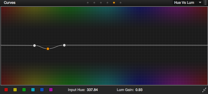
Adjustments for the above. Catching that transition from green to yellow.
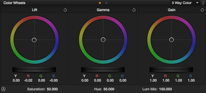
Next, we’ll move to the offset controls. We’re going to pretty radically shift the color balance around underneath the black and white node so that some of the colors in the image over-saturate. We’ll start by cranking up the red channel:
Upping the red makes the whole image brighter.
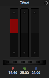
That’s a whole lot of red.
Next we’ll lower the green:
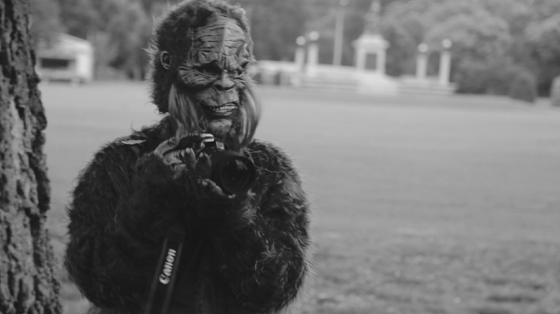
Lowering the green brings the image back to a normal brightness, though it’s a little dark…
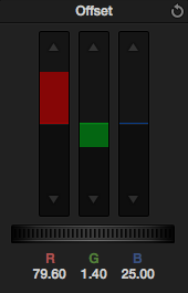
We don’t lower the green as much as we lifted the red.
You can already start to see some crunching happening (look around the face and fur). Now we’ll lift the blue channel to brighten the image up a bit:

Now you can really see the crunching around the fur and face.
Lift the blue channel a good bit.
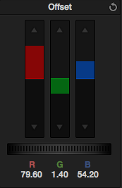
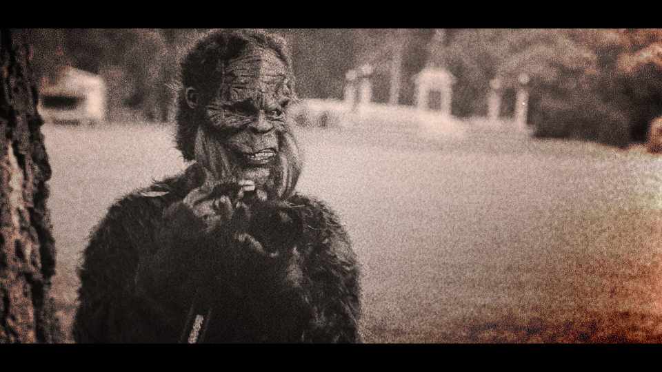
Now that we’ve got that crunched/clipped but still milky look, we’ll warm up the shot. Add a new node after the 2nd one you added earlier (the one with 0 saturation), switch to the Log color wheels and push some orange into the offset:
Introducing some color
The offset pushes the hue into the whole image, regardless of tonal range.
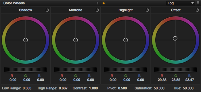
Now we’ll switch back to the 3 way color wheels and push just a little bit of green/cyan into the shadows to offset the warm tones we just pushed in:
Still warmer than plain black and white, but the shadows stay more neutral.
A pretty small adjustment does the trick.
Now we’re gonna move to the highlights and push in a good amount of warm color:
This really gives it that sepia tone look.

A yellow/orange tone is the what gets pushed in.
We’ll pull it back just a tad in the mids with a little blue:

Looking good!

Just the slightest amount of blue.
The next step is a good vignette. We really want to focus on our subject (who is much darker than the background), so it’ll be a pretty small window:

The window, centered on Bigfoot.
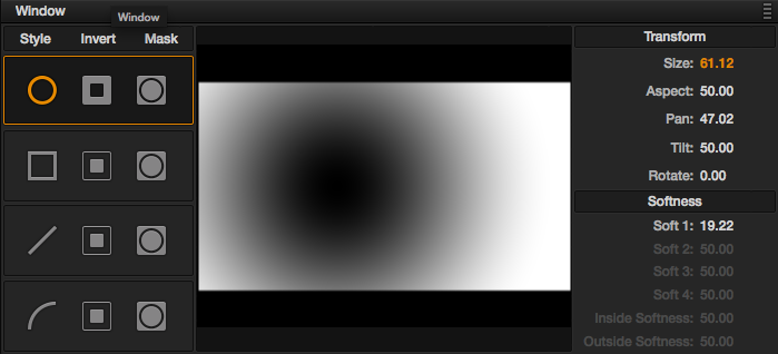
The settings for the window
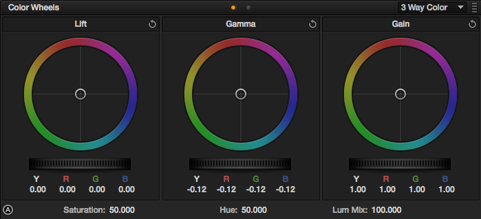
We’ll start in the mids:

Lower the mids a bit.
Adjustments for the above.
That brings some nice focus to Bigfoot, but we’ll do just a little bit more in the shadows:

The final image out of Resolve…
Lower the shadows a bit.
Here’s what the final node structure looks like in Resolve:

The first node is the balancing node. The second is the color crunching, the third is the black and white, the fourth is what warms the shot up, and the last is the vignette.
Now, this is supposed to be a vintage film look, and what is a vintage film look without some film grain? After I got to this step, I brought the shot into After Effects (where I was finishing the whole piece), letterboxed the shot (we actually letterboxed the whole video), and added some grain from my awesome Cinegrain package!
The first grain used is a heavier 8mm grain
After tha first grain, a vintage grain from the “Looks” collection was added to give it some extra coloring and darker areas:
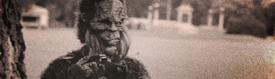
The final image.
Fun stuff! It’s a little crazy and definitely project-specific, but still, fun to do.
Attached is the Resolve PowerGrade for this look. Append it after your first node (this PowerGrade does not include the first “balancing” node in the image above), don’t forget to adjust the first node you already had to balance your specific shot. As usual, feel free to use this look in your projects all you want, but please don’t share or distribute this preset. Instead, send them here to get it.


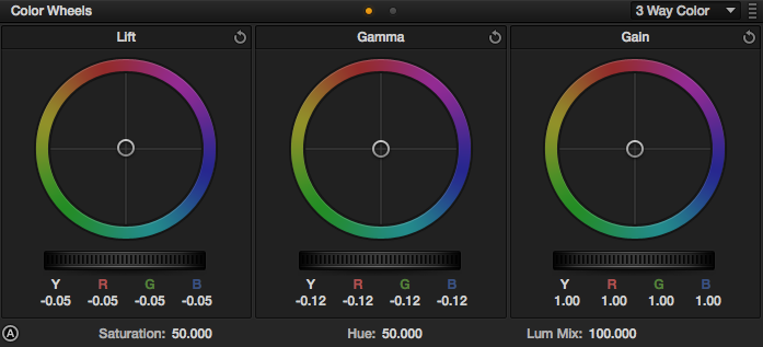
08/11/2013, 6:44 am
Thanks for sharing!! ;)
10/11/2013, 1:36 am
Too good information & tip
Thanks
06/26/2014, 9:48 am
12/01/2015, 11:04 am
06/18/2021, 4:35 pm