
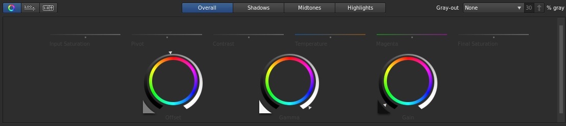
The look for this post is one I worked up for fun a while back when I was working on a freelance piece. I didn’t end up using the look (I cooked it up just for fun; I was only doing the editing), but I saved it, and thought it would be fun to share. I did this look in SpeedGrade to give myself a new challenge. I won’t go into my thoughts on SpeedGrade in this post – I’m going to wait and see what changes they make when the “CC” version comes out in June before posting my thoughts.
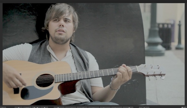
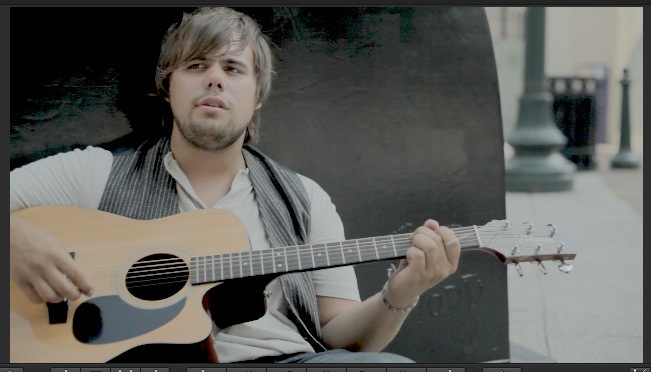
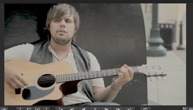
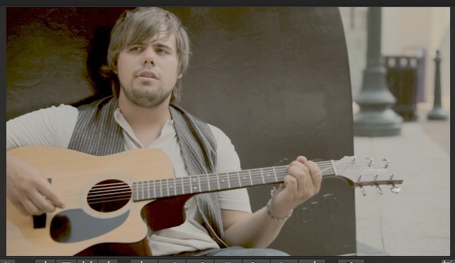
Anyway, the purpose of this look is to create a vintage/yellowed/aged/faded 60’s or 70’s film feel. It would go really great with some Cinegrain or GorillaGrain, etc. Here’s the shot that we’ll be starting from:
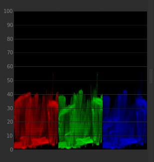
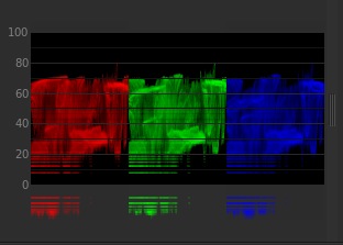
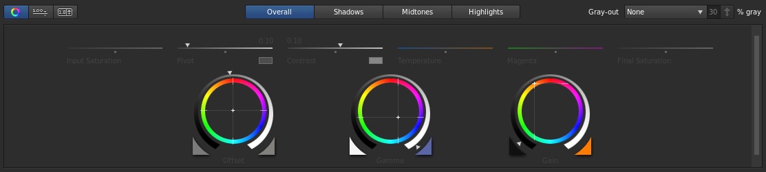
Here’s the original waveform for reference. We’ll be using the waveform monitor for a few of the changes in this look:

The original image

The original parade. It’s a pretty good spread.
The first step is to lower the highlights pretty much all the way down, to give the appearance that the footage has faded:

Drop the highlights down.
Lower them almost all the way down. We really want them faded out.
Here’s the parade for this step. Pretty squished.
Next, raise the mids to compensate until the majority of the highlights rest at around 70IRE on the waveform:

Raise the mids to make the image around a “normal” brightness.

To get the image to look good, we raised the mids almost all the way up.
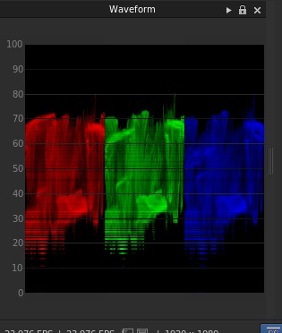
The key isn’t to raise the mids to a certain value, but to raise them until the “highlights” hit around 70IRE on the waveform, regardless of where they started.
Now, lower the offset to crush the few remaining blacks. We’re looking for a really burnt/crushed shadow look here:
Crush the blacks. We want them a little burnt for this look, since we’re simulating film that is deteriorating.
Lower the blacks just a bit.
We crush and clip them below 0IRE.
After playing around with it for a bit, I decided that I wanted a little harsher contrast in the blacks, so I upped the contrast slider:
Crush the shadows more! We want a pretty hard diving line where the shadows start.
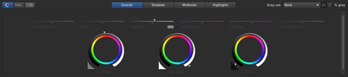
A small contrast adjustment.
Then I lowered the pivot so that I kept the harsh shadow line, but less of the image was in the shadows:

We want the harsh shadows, but we want less of the image in shadow. This is a “faded” film look, not a “crushed” film look.
It was a pretty large pivot adjustment.
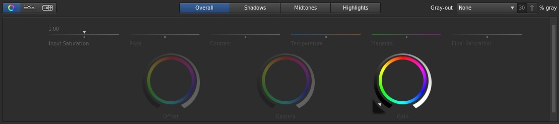
Now for the colors! Push a ton of yellow/orange into the whites for that aged/yellowed look:
Yellow those highlights as much as you can.
Yeah, that’s all the color I can push in. We’ll add more in a bit.
Push a little of the same hue into the shadows, but go easy. A little goes a long way in the shadows with this look:
Nice and warm.

A little goes a long way with the shadows in this look because of the extreme adjustments we’ve made to the image.
Cool the mids a little bit to compensate for all of this warmth we’re pushing in:
Cool it down just a tad.
Just a little blue/cyan into the mids.
Raise the saturation just a bit to bring his skin tones back to a more normal range:

More saturation, mostly for the skintones.
It’s a small adjustment until the skintones look more natural and less ashen.
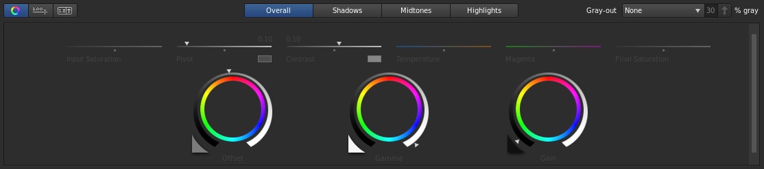
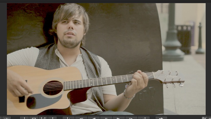
Last step: go to the “Highlights” tab and push some warmth into the highlights again. This gives our highlights a definite color (yellow/orange) not just a “warm look”. We don’t want any pure white/grey in the brighter parts; this is what gives it a “faded” feel:

Yellow those highlights. A little pure (desaturated) white as possible.

The temerature slider is the easiest way to do this.
I hope you find this look useful. It’s definitely more of a utility/aggressive look than a beauty grade. I’ve attached the SpeedGrade preset export that you can download. It actually include the SG “Look” file as well as several formats of LUTs that I guess can be applied in other grading programs (with unknown success. I only tried this in SpeedGrade…). As usual, feel free to use this look in your projects all you want, but please don’t share or distribute this preset. Instead, send them here to get it.


05/17/2013, 2:22 pm