Use a “lightbox” to see consistency, progression of a grade over time, and to pick out problem shots. The lightbox can give you a (very useful) 10,000 ft. view of the project you’re working on.
Wow! It’s been a long time since I had an official “colorist tip”. This one comes full-circle from my early days to a project I’m in the middle of right now.
On the very first short film I ever graded (In After Effects! Using SA Color Finesse! In College! Before Apple Color even existed!), the director had a very specific vision for the color in the film. Both of the main characters had their own specific “color” (The girl was red, the guy was blue) that was planned and carried from wardrobe to production design to the grading. The film was a story of unrequited love, and the colors in the film would shift at a key scene when the guy decided he couldn’t pursue the girl, and the girl realized the guy liked her, only to find out he had left. It’s a long story, and I wasn’t the writer or the director (just the editor and colorist), so don’t ask :)
Anyway, to make sure that the color progressed smoothly over the course of the film, I used an AE script that Stu Maschwitz had provided in his DV Rebel’s Guide. The script made a dynamically updating thumbnail comp based on markers in your master comp. This was my first experience with using a “lightbox” for color grading. My first pass was the below:

The first pass at color, using the director’s plan for character-specific colors, storyline color shift, and overly dramatic hue and saturation.
After doing this first pass and following her initial direction, we reviewed the film and looked at the lightbox. We noticed that the color transition (which happens at the scene where both hands are on the fishbowl) was very abrupt, so we decided to smooth the transition out, making the beginning just a little less red, and the end less blue:

The second color pass, after reviewing the film and looking at the initial color progression using the lightbox.
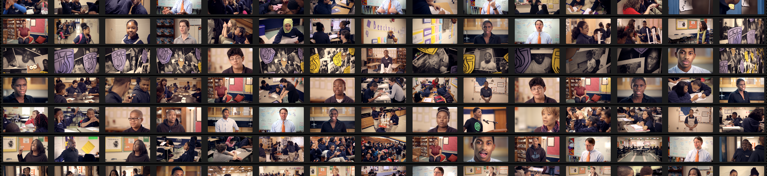
The lightbox is a fantastic tool to view color progression from shot to shot, scene to scene, over the course of a film. The lightbox can also be used to look at consistency of color and find shots that stick out too much. Here’s a piece I’m actually in the middle of right now:
My first pass at color for this 4min. promotional piece.
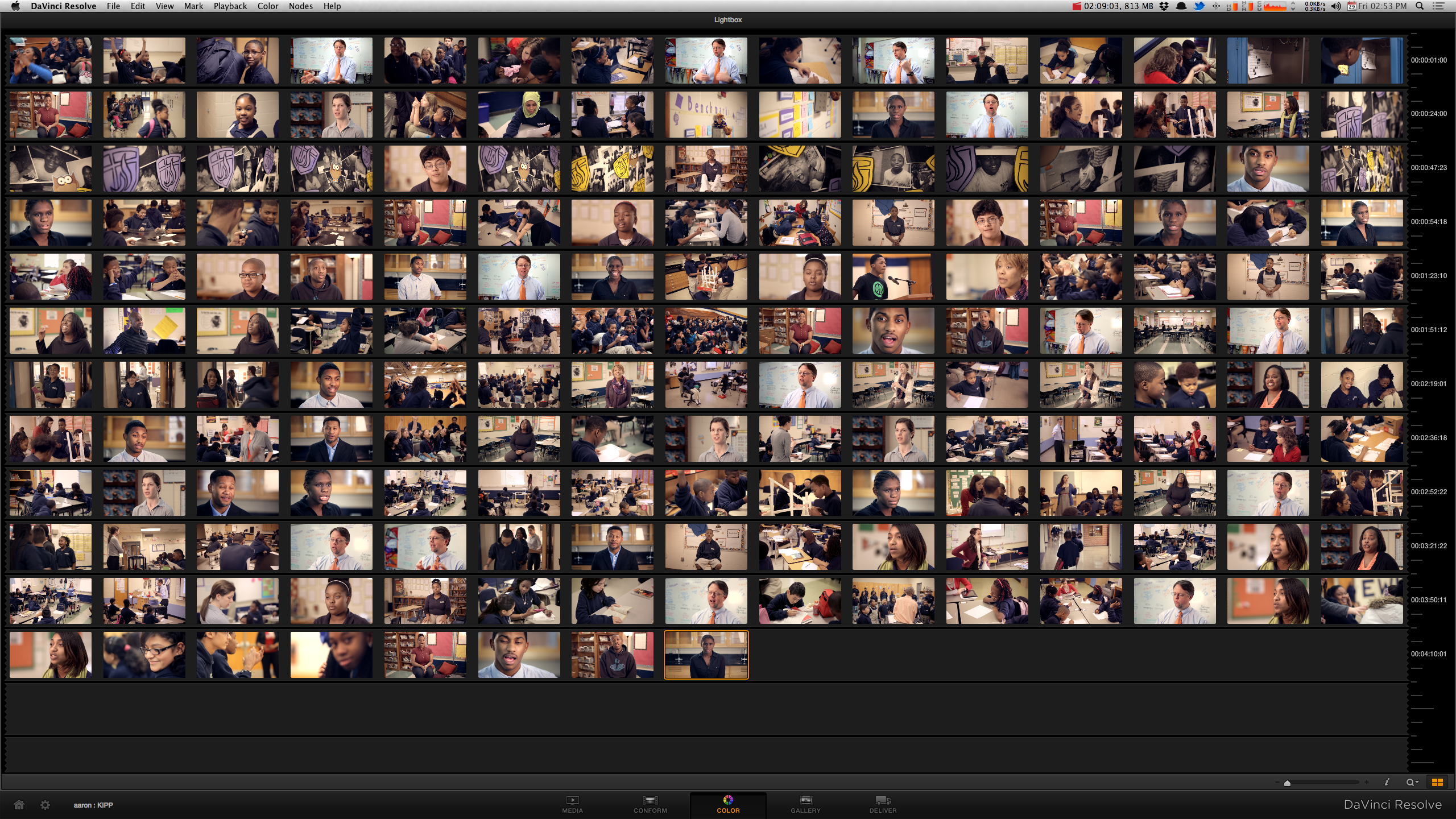
These days I’m using a much more powerful tool for grading, and Resolve has this awesome lightbox feature built right in. Looking at the lightbox from my first pass, I can see that the look is pretty consistent across the piece, but one specific shot sticks out like a sore thumb. The interview shot with the guy in front of the whiteboard is far too blue, especially in the highlights, compared to the rest of the piece. The lightbox helped me notice this, and I’ll go back and correct it when I do a final color pass (I’m still waiting on some VFX shots to be finished. This was just a rough color pass).
The lightbox is a wonderful tool (one that I missed greatly in Apple color and am glad to have back in Resolve 9), and you should definitely consult it to get a 10,000ft. view of the project you’re working on.


04/11/2013, 6:22 am