Well, today’s tip will be this site’s first Guest Post! Rob tweeted a great colorist tip the other day, so I thought I’d see if he’d like to expand it a bit for the site. Rob’s a great colorist based in Boston, and a great help on twitter as well! Here’s a short little paragraph I asked Rob to write to introduce himself:
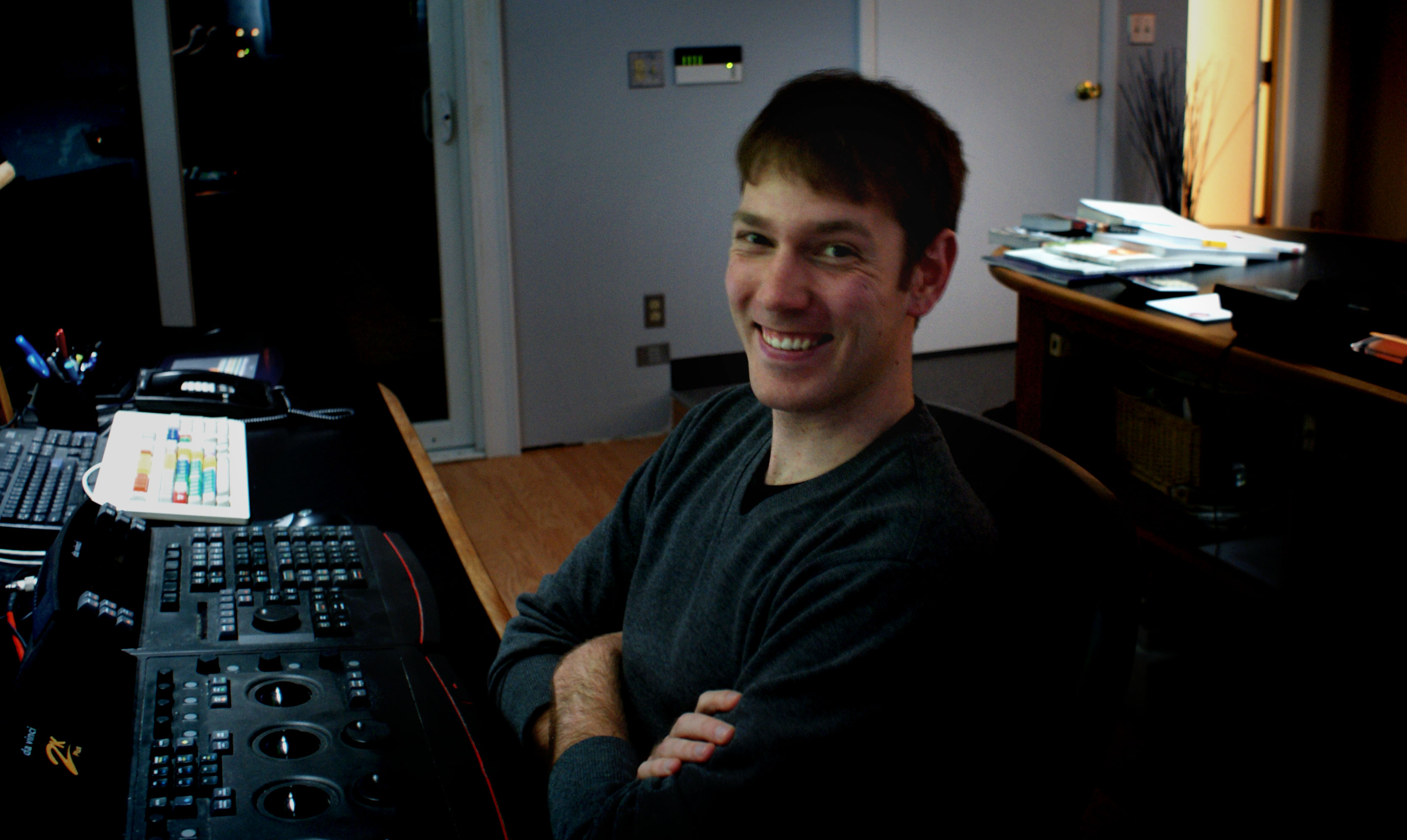
I have been following Aaron’s “Colorist Tip” series on Twitter for the past year and am honored to be the first guest post on his very helpful and useful blog. While cranking on the color wheels in Boston on a DaVinci, I have seen an interesting spectrum of work ranging from the standard :30 spot to archival 16mm footage from local colleges like Harvard and MIT. This wide range of footage has allowed for me to experiment, test and experience most formats and the way that they react to grading.
Color grading has been a great passion of mine, as it allows me to explore both my artistic and technical side. I feel truly blessed to work in a field that I am passionate about and look forward to future developments that will no doubt press this art form and it’s artists even further. Follow me and my post house on Twitter @robsbessette and @finishboston for more post-production adventures.
Now on to the good stuff!
Have multiple looks ready before client arrives. Favorites are high contrast/saturation, warm/cool, or abstract depending on the subject. Make sure your looks are relative to the piece.
We all know that color grading is about creating “looks”. The real question is, what look is the right look? Without experimenting and trying out different styles, we will never know. There is never a correct answer, we just know what the “right look” is when we see it. It is not only important for us to see different looks, but for the client to see them as well. A lot of the looks that I create before a session depend on the subject matter of the piece. Is it cheerful? Moody? Romantic? I generally like to have 3-4 options prepared before the client walks through the door. Normally when creating looks I stick to the primaries as I find that it gets the mood across rather accurately. There can be enormous amounts of work done in the primaries and I sometimes feel that Colorists are too anxious to breeze through this step to get to working with the more luxurious and exciting secondary and keying options.
Currently I am working on a action short, revenge story called “Hard Luck” that takes place in a bar. Based on the nature of the short, I wanted to come up with some harder looks. No dreamy looks or soft edges to this one. Shot on the RED camera, there was some good latitude that provided me with the opportunity to get creative.
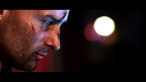
Look #1
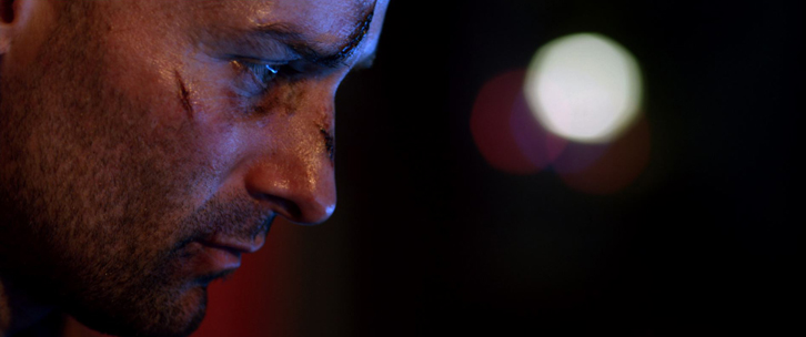
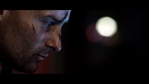
For this look I wanted to create something that was true to the real life colors on set with an average contrast ratio and good saturation. I was looking to bring out the hard lines on the actors face to accentuate the dramatic feel. While crushing the blacks and making the skin tones pop it feels almost as if the actor is surrounded by darkness.
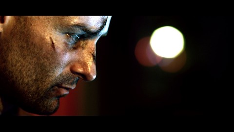
Look #2
On this look I decided to go the opposite direction by creating a less saturated look. By taking some of the color out of the skin tone, the scars on the actors face seem even more dramatic.
Look #3
This grade probably looks the “prettiest”. Turning up the gain on this shot allows for a lighter look that covers a higher range of contrast. While keeping a high contrast ratio along with boosted saturation, this shot looks very pleasing.
Look #4
I generally like to throw one abstract look into the mix just in case the client wants to go to extremes. These are generally my guilty pleasure, as they allow for me to let the creative juices flow. On this look I allowed the highlights to blow out and pushed the skin tone towards green, creating a very hard/tough look.
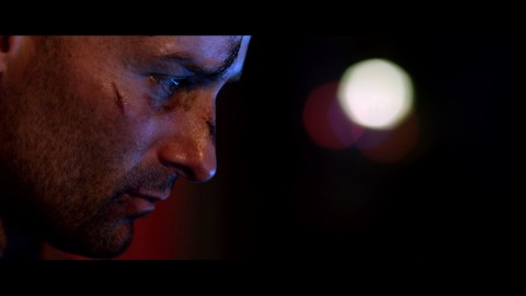
Final Result
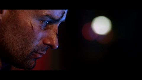
The client ended up choosing Look #1. Since the short is filmed in a bar they wanted to keep the light down, but allow for good saturation at the same time. For the final correction I added a power window to the actors face so the scars popped a little more and drew the viewers focus to the character.
When it comes down to it, it is all about seeing and exploring different options. By having looks ready before the client even walks through the door, you’ve show that you are familiar with the material and have placed great thought into how the piece can look. As long as the client feels comfortable that they have seen all possible options that are fitting to the piece, then you’ve done your job.
Happy coloring!
Rob Bessette – Colorist


06/16/2011, 6:44 pm
Is that Derek Jeter?
06/19/2011, 12:15 pm
Nice!
Thank you for the great tip idea.
Best,
J
06/19/2011, 11:46 pm
great!great works!