I was watching Gran Torino a while ago and noticed the unique look it had. I planned on doing a post about it back then, but soon after things really picked up with getting ready for the baby. A week or two ago, I watched The King’s Speech, and noticed that it had a similar (though not identical) look that reminded me of the Gran Torino post I wanted to do.
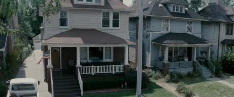
Here are a few still from the movie:
Looking at these frames, here’s what I noticed when trying to dissect the look: It seems to have a Blockbuster Look base, but way more desaturated, except for the skintones. The muted color scheme gives it a more serious tone, but the warm skintones still pop.
Here’s my recipe for an approximation of this look. We’ll start with the ungraded image:
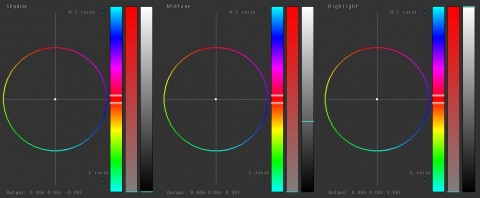
We’ll add a little contrast in the primaries (pull down the shadows and mids) to give us a base to start with:
Next we’ll apply the blockbuster look using the push/pull method into a secondary:
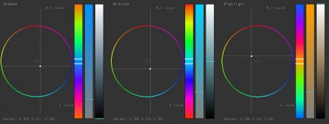
Now that we have the base, the next step is to desaturate the image in another secondary:
After doing this, you’ll probably notice that the cool colors show through the desaturation better than the warm highlights did. Our last step in this look will be to push the warmth back into his skintones. We’ll do this by pulling a key/qualifier instead of just pushing it into the highlights in a new secondary. This will let us just target the skintones:
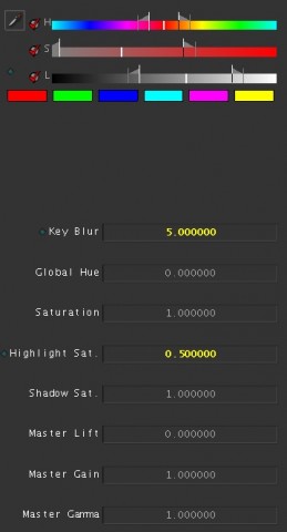
The key settings. I also pulled down the highlight saturation, because some of the tones were getting a bit super-saturated when I pushed the warm hues in. Your needs may vary on this.
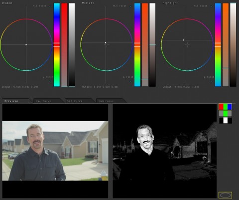
Here you can see what was actually keyed, as well as the warm tones pushed into the mids and highlights. Notice the bleed on the key – it’s not imperative that this be a perfect key for this look, so a soft key will work just fine as long as it is not too noisy.
Here’s the final look:
Attached is the Apple Color secondary for this look. You will probably have to adjust this for your shot, but it should work as a good base. As usual, feel free to use this look in your projects all you want, but please don’t share or distribute this preset. Instead, send them here to get it.


