One of the three main questions you should ask when on secondaries: “What distracts me from the subject/bugs me in this shot?” Look at the shot and see what your eye is drawn to first; It should be the subject. If it’s not, you have work to do.
I mentioned in a previous post that we’d come back and look at the secondary corrections and how I arrived at the final image. We’re going to look at this in two parts. If you remember, this is the original, primary balanced image:

Primary corrections only
And at the end of that post, we arrived at this look (refer to the aforementioned post to see how we got here):

Here's where we're going to start for this post
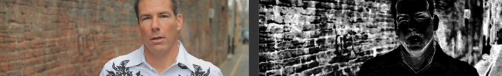
Looking at the above, we ask ourselves, “What is distracting me from the subject in this shot?” or “What bugs me in this shot?” (two ways of asking the same basic question). First thing that jumps out at me – The brick in the background is too close to the same color as his skin, and it’s a little too light/bright. It’s bugging me, so we’ll go to a secondary and fix that. We’ll start by pulling a key on the brick:

The key I pulled on the red parts of the brick that were bothering me

Key settings for the brick
It does get a little of his face, but our adjustments won’t affect that too much for the worse. Now that we’ve got it keyed, let’s knock it down. I adjusted just the midtones to get it to a brightness that I was comfortable with:

I pulled the mids down quite a bit, but left the highlights and shadows alone

Compare this to the starting look and see how much less distracting the brick is...
Now that we’ve taken care of that, we’ll move on to the other distraction: though the background is visually interesting and vibrant in color, it may be a little bit too interesting and vibrant to the point of distraction. I don’t want to take it out completely, because it is cool, but let’s knock it down just a little. Here’s what I decided to do – I started with a soft circular vignette centered on his face:

A soft circle window centered on his face
It may seem like we’re going to do an edge darkening vignette…but we’re not (at least not in this post). What we are going to do is switch to the “outside” of the window and pull down the saturation, killing some of that vibrance but leaving his face mostly alone, without going the hassle of keying his skin from the background:
I pulled the saturation "outside" the window down to .8 - it does the job in a nice, subtle way.

The background is still interesting, but not too interesting...
It’s a subtle effect, but it does the job just right. Aggressive looks may be popular, but there’s still something to be said for subtle solutions. We’ll finish up this image soon, as we ask the next two big questions for secondaries.
This is an example of what I saw when I asked myself this question, but it definitely changes for every shot and project. So next time you grade, make sure you ask yourself this!


