The “look” of a movie can depend on the colors in the production design almost as much as what the colorist does with it. The key here as a colorist is to work with the production design, not just force your own look on the footage.
Production design and color grading are surprisingly connected. The color of the walls in the living room, the color of the clothing for the lead actress, the color of the getaway car, the color of the buildings in the background – almost everything that makes up the image you are grading was chosen for a reason.
The best production design is chosen to compliment the look that the Director and DP are looking for. Going for a “blockbuster” look? Chances are you’ll see a lot of either neutral colors or cool colors in the clothes, blue jeans, and neutral background colors like gray or white buildings and cars. Looking for a warm, sunny look? You’ll probably see yellow and white clothes, white houses, with accents of green.
Lets look at some examples. for each of these, look at the overall “look,” then look and see what colors are actually in the image in clothes, paint, etc.:
Blue and green in the background, blue jeans, black shirt, and a yellow car...
blue short, blue shorts, blue-ish bikes. warm sign, warm skintones...

Warm look, warm production design...

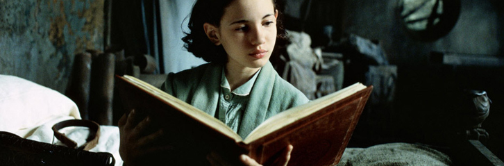
See anything warm in this "cool" scene besides the book and her skin?

Notice the use of neutral clothing to help it blend with the warm look outside...

Then his neutral jacket blends just as well with a cool scene. Would it blend as well if his jacket was brown?

See any cool production design in this warm scene?
Work with the production design and you’ll have a much easier time creating the look. You’ll also make the director and the DP happy, since they had an integral part in deciding what colors showed up in the scene.


