Stuart Samuels (@stusam81) tweeted me this past Sunday about recreating the look from Sherlock Holmes:
@videoaaron A bit cheeky but do you have any quick tips on creating this antiquated look from Sherlock Holmes? http://t.co/s7ymRftM
— Stuart Samuels (@DeathFrmTheLeft) June 24, 2012
Here’s the reference image he sent me:

He also said that he did most of his work in After Effects, so this post will be using Colorista II. Let’s get going!
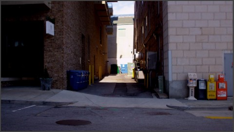
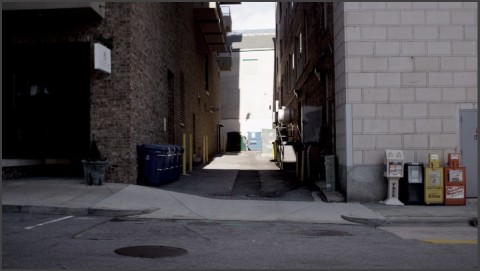
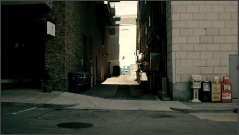
Here’s the balanced image I started with. It was chosen for it’s similarity to the reference pic. On a side note, this was shot with a Red EPIC and graded directly from the R3D, but I didn’t use any of the Red settings, just Colorista II.
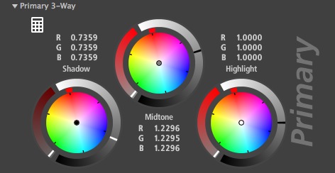
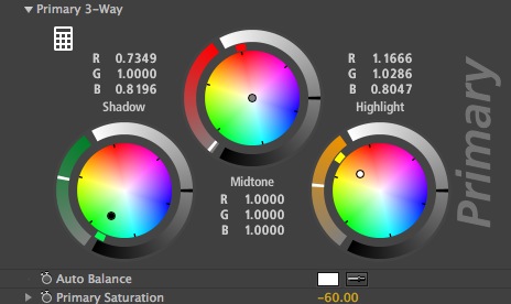
My first step was to get the contrast right. Typically when increasing contrast I’ll adjust the shadows and the highlights first, but in this case I used the shadows and the mids. Here’s why: when I was looking at the reference image, I noticed that the blacks were very crushed, but there was a much more noticeable line between the shadows and mids than usual. I’d seen this before, so I knew that using the shadows and highlights to increase contrast would keep a relatively smooth gradation between them and the mids. But! – If I used pulled the shadows down first then used the mids to brighten the shot back up, this would make the gradation between the mids and shadows more distinct. I’m probably not doing a god job of explaining it, but trust me, it works.
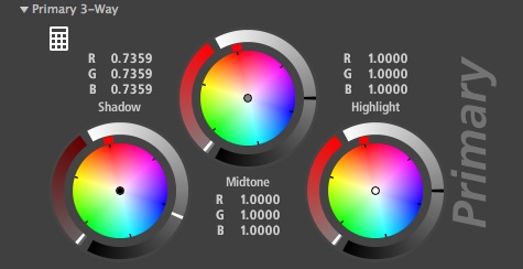
All of that said, first I pulled down the shadows:
Next I used the mids to pull the shot back to a good exposure:
Now that that was done, I added a new instance of Colorista. I did this because after some trial and error, I found that it just didn’t work well to do the hue adjustments on the same instance as the contrast with this look for some reason.
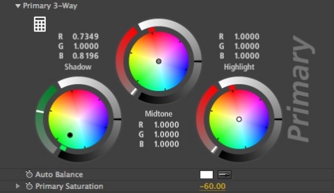
On the new instance, I pulled down the saturation first, since the reference is obviously desaturated. This would help me get the right shade of green in the shadows (as we’ll see in a moment):
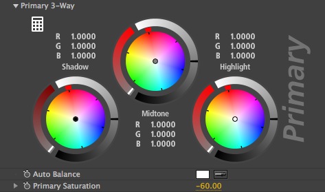
I tried pulling it down by 70% at first, but after messing with it, pulling the saturation down by 60% felt right to me.
Next I added in the green to the shadows, as that’s the most noticeable aspect of the look to me:
Next was to get those nice warm highlights on the lighter parts of the building (one of the reasons I chose this shot was the similar light sections on the building):
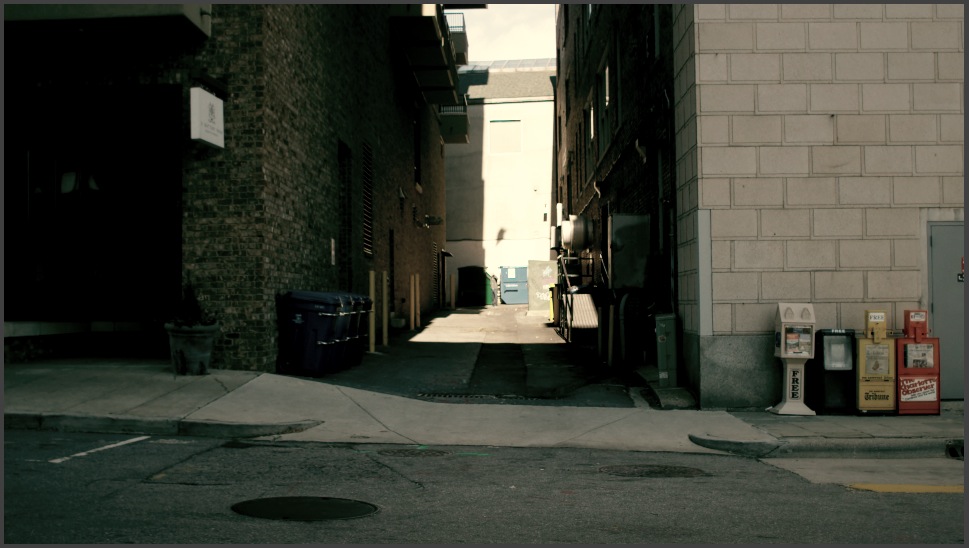
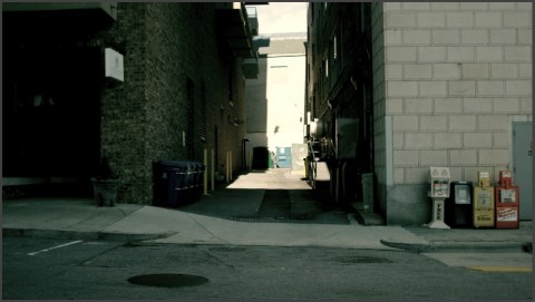
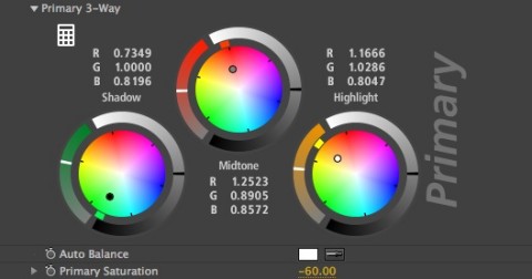
Last up was to use the mids to match the reference. This part was mostly trial and error until is looked similar:
After trying this look out on a couple shots, I noticed two things:
- This look doesn’t do so well on shots that are too bright. The “feel” of the look comes from the green shadows, and if your shot is mostly highlights and some mids, the shadows just don’t get a chance to show off the look very well.
- You have to do a little more work with skintones. Stuart sent me another reference image with an example of a close-up, and when I applied the look to a similar shot, the skin tones were lacking that bronze characteristic. Some of it I think is make-up (to make his face look a bit dirty), but I used the second instance of Colorista to apply a secondary to warm up the skintones. These are the settings I found worked well:
I’ve attached an After Effects preset that you can download. I think it may only work in AE CS6, since that’s what I was using, but if it doesn’t work just match the numeric values in the pics above to recreate the look. The preset should probably be applied to an adjustment layer, with any balancing done on the actual shot’s layer separately. It will add the two instances if Colorista II, with the secondary setting applied but bypassed, so if you want to use them just uncheck the “bypass” box and set your key to the skintones in your shot. As usual, feel free to use this look in your projects all you want, but please don’t share or distribute this preset. Instead, send them here to get it.






08/27/2012, 10:58 am
This is great, thanks for sharing!
01/23/2015, 11:54 am
12/28/2017, 11:01 am
Hi is the the preset still available? would love this look on a project