The “Blockbuster” or “Transformers” look = Cool shadows – usually blue or teal, and warm skintones, usually an orange color. Pushing the skintones warmer usually means the midtones, but it can be the highlights to if the footage is bright.
The blockbuster look is a big trend right now, so lets learn one way to make it. FYI – This version uses the push/pull method, and won’t work on every shot. Some shots you just have to key the skin to get it to look right.
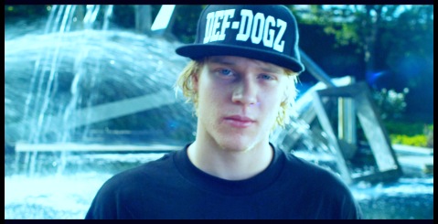
Let’s start with a primary-balanced image as usual:
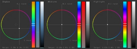
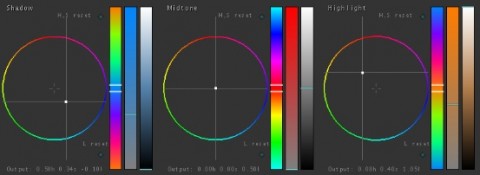
The first step is to push the cool color into the shadows:
Remember that since we are using the push/pull method, we need to push it way too far to begin with, then pull it back in the other tonal ranges. The other side effect of pushing this much color into the shadows is that they start to get a little milky, so let’s bring them back down:
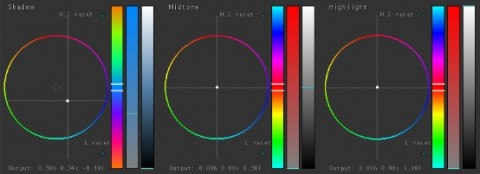
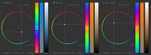
Now that the shadows are taken care of, lets add in the warm skin tones. For most shots, the skin tones will be in the mids, but depending on the shots, it is possible that the highlights will affect the skintones more. In this case, after playing with the shot a bit, I know I need to adjust the highlights first, so I’ll push them warmer:
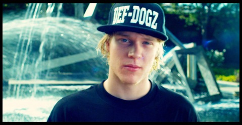
Notice that I also pulled the highlights up a bit in brightness, since they were looking a little dull. We’re almost done, but a characteristic of the Blockbuster look is skintones that are a bit (or sometimes a lot) overly warm. We’ll use the mids to get that look:
This is my recipe for a blockbuster look. One thing about this look is that it works better with complementary production design, and every shot will take this look differently.
For the Apple Color secondary attached, first balance the shot in the primaries. For the secondaries I did something a little different: I usually put the look in the first secondary, but this time I put it in secondary 2; the first one is blank. here’s how to use the blank secondary 1: adjust the brightness sliders to affect what areas of your shot get what color (essentially you’ll subtly remap the tonal ranges). Use small adjustments for this one. Also, for this preset to work, make sure you have a very well exposed image, or at least your primary grade changes it to well a exposed image. This preset won’t always work right away, so use it as a starting point for your grade. That said, I did try it on several different shot and shows, and it did a pretty good job, so enjoy!
As usual, feel free to use this look in your projects all you want, but please don’t share or distribute this preset. Instead, send them here to get it!





03/02/2011, 2:02 pm
Can you go into a little more detail about the tonal remapping using S1? Tonal remapping like Color Finesse’s Luma Curves and the Luma Range UI?
03/07/2011, 10:25 pm
It’s similar in function to what you can do in Color Finesse, where you can adjust what areas the program treats as shadows, midtones, highlights when adding in hue or tonal changes. The big difference is that this is kind of a “poor-man’s” way of doing it since Color doesn’t include that feature. It works because whatever adjustment you do in secondary 1 to remap (for example, raising the blacks a bit to push the top end of the blacks into the low-mids) can be compensated for in secondary 2 (like crushing the blacks back down to get your contrast back). Sometimes, you can (or have to) compensate in secondary 3 or above, if you’re pushing a lot of color in secondary 2. Like I said, it’s kind of a ghetto version of actual tonal remapping, but it works pretty well with some push and pull work between the secondaries. The key is to use small adjustments in that first secondary, for a subtle effect. If you find yourself making big adjustments to get your look, you’re probably just not pushing the right hues into the right areas, and there’s bound to be a simpler way to get you look.