Some things I wrote...

My Blog

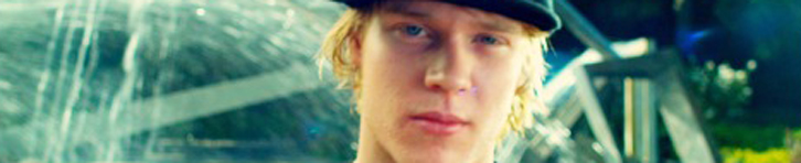
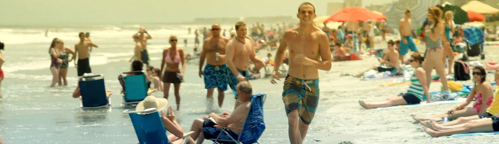
Colorist Tip #22 – The L.A. Grad
The "L.A. Grad" look = slightly contrasty, a gradient with orange on top, blue on bottom (one variation has a neutral bottom). The L.A. Grad look is best used for beach scenes or really anywhere in Los Angeles. The LA grad(ient) look is named after the hazy, orange sky you...
continue reading
Colorist Tip #21 – Blockbuster Look
The "Blockbuster" or "Transformers" look = Cool shadows - usually blue or teal, and warm skintones, usually an orange color. Pushing the skintones warmer usually means the midtones, but it can be the highlights to if the footage is bright. The blockbuster look is a big trend right now, so...
continue reading
Colorist Tip #20 – Bleach Bypass
Bleach Bypass = Super contrasty, low saturation. A very harsh look, often used in war movies. There are a few variations of bleach bypass that are used frequently: cool (blue), warm (tan), and greenish. Here's my recipe for bleach bypass. Start with a balanced image as usual: I do a bleach...
continue reading
Colorist Tip #19 – Prod Design II
Know you're going to be grading a movie that's still in pre-production? Go ahead and talk with them about the look & production design. If they have an idea of what look they want, they can make your job as a colorist easier with good production design. A lot of...
continue reading
Colorist Tip #18 – Prod. Design
The "look" of a movie can depend on the colors in the production design almost as much as what the colorist does with it. The key here as a colorist is to work with the production design, not just force your own look on the footage. Production design and color...
continue reading