The “L.A. Grad” look = slightly contrasty, a gradient with orange on top, blue on bottom (one variation has a neutral bottom). The L.A. Grad look is best used for beach scenes or really anywhere in Los Angeles.
The LA grad(ient) look is named after the hazy, orange sky you sometimes see in LA (it’s also reminiscent of sunsets). A few major cities have looks that define them (more on that in a later tip), and this look is a great way to say “this film/shot takes place in Los Angeles!” Let’s get started making this by starting with our primary-only balanced image:

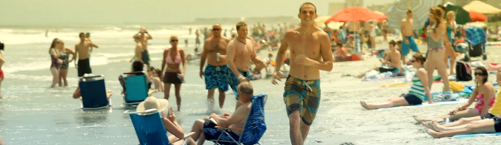
The basic balanced image
I’m actually going to use 2 secondaries for this look (even though it could be created with only one) to maintain flexibility for other shots. There are two variations that I’ve seen of this look. Both have an orange tint at the top of the gradient, but one has a cool blue bottom and one has a neutral bottom. We’re going to make the one with the blue bottom, and if you want the neutral bottom, just skip this part.
The first step is to push the mids and the shadows to a cool blue color in secondary 1. We want to give it a cool base, but we don’t want it to be all blue, so we’ll leave the highlights alone:

A cool blue look as a base for the gradient

Adjustments for secondary 1
Now we’ll move to secondary 2. The first step here is to set up a vignette shape / power window to use as the gradient. Turn on the vignette, set it to square, and make a nice, wide rectangle. bring it’s softness up to around, say, .4 and increase the size until you can’t see the sides or the softness on the left and right sides. Now drag it up until the bottom of the shape is around the top “third” line, like below. Make sure it’s the actual shape bottom, and not the inside or outside softness for the bottom. If you did it right, it should look something like this – click on the image for a larger view (the values are for 1080p, and feel free to round off the numbers):

I got these values with mouse controls, so please excuse the messy values...not that it matters for actual grading :)
We set the window up this way to act as a soft gradient where we can put a lot of one color in and it will get softened out. Now that the gradient is set up, let’s add in that orange! This technique also utilizes the push/pull method – you added in a cool base, now we’ll pull it back with warm tones – except this time we’ll go a little bit further. We’ll push an orange hue into all three tonal ranges – mostly the midtones, and about half as much or less in the shadows and highlights:

You add in orange, and the gradient we set up will soften out the effect.

Mostly adding in the hue in the mids, but all ranges get the color.
Look at what this produces, we have one thing let that I want to do: the image looks muddy, so lets add some contrast, but we want it to affect the whole image, not just the grad area, so we’ll do it back in secondary 1:

Just pull the shadows down and the highlights up a bit to increase contrast
And here’s the final image with the L.A. Grad look:

The final look
Here’s the great thing about this look and doing it this way – too harsh an orange on top? Instead of having to play with the color values, just adjust the vignette: move it up and increase the softness for a more subtle effect, or decrease the softness for a hardline sky, like in a “Downtown LA” shot. Also, want a neutral bottom instead of a cool bottom for the gradient? Just turn off (or adjust) secondary 1 to get what you want “underneath” the orange. It’s very flexible doing it this way!
Attached is the Apple Color secondary for this look. Use it just like suggested above, adjust it for each shot, and it should be a great base for you. As usual, feel free to use this look in your projects all you want, but please don’t share or distribute this preset. Instead, send them here to get it.


