Here’s a look I did a good while ago (almost a year and a half ago), but it’s remained one of my favorite looks I’ve done. I wanted to do a variation on the blockbuster look so the subject would pop, but at the time I was fascinated (for some reason) with finding a way to incorporate purple well in a look. This is how I managed to pull it off…
This was what I started with:

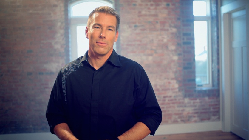
One of the harder images I've had to balance because of all the warm colors.
I’m not going to break down how I balanced it. If you’ve been reading this site long enough, you know a few tools to do that. Here’s the balanced image:

Much better!

Adjustments for the balanced image above.
Now for the look. First is to adjust the shadows. After doing a bit of experimenting and seeing as how purple was closer to the bluish hue to push into the shadows in the Blockbuster look than the orange you pull back in, the shadows seemed the best place to get that purple worked in like I wanted.

Way to far, but that's the beauty of a push/pull look - it'll get fixed in a sec.

It's technically a little on the bluish side of purple, but it gets the shadows the hue that I want them to be.
Now we’ll pull it back in the mids:

More natural on the skintones.

Pull in the opposite color of what we pushed; in this case a green.
Now I’m going to do something a little unusual for the sake of the overall look. I want the background to be just a little bit warmer, so we’ll put little orange in the highlights to warm the background:

A little warmer on the brick.

A little orange to help the background.
Now we’ll pull a key to get the skin tones where they belong:

Closer to natural skintones.

The matte for the key.

The key settings. Just a hue and saturation; no need to use a luminance qualifier.

Some sea-green in the mids did the trick.
Lastly, an edge vignette to focus attention on the subject:

Window settings

Unlike the last few posts, this is the typical vignette I use; the contrast adjustment is made in the mids.

The final graded shot.
Here’s an example of a close up with the same look applied:

Before

Balanced

After
There you go! One of my favorite looks. It’s not going to work on every shot, as this grade is highly dependent on the production design, but I’ll still make it available for download.
Attached is the Apple Color secondary for this look. You will probably have to adjust this for your shot, but it should work as a good base. The 1st secondary is blank so that you can balance in the primaries, then make any other adjustments necessary to make it look good in S1. As usual, feel free to use this look in your projects all you want, but please don’t share or distribute this preset. Instead, send them here to get it.


