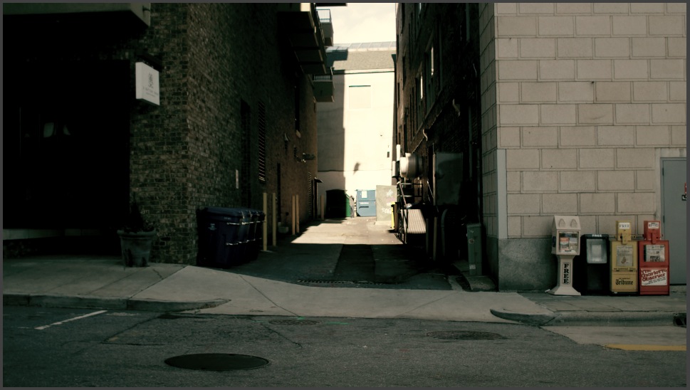
- Contrast is King – Part 1Let's talk a little bit about contrast. The dictionary defines contrast as such: [quote_left]contrast noun |ˈkänˌtrast | the state of being strikingly different from something else, typically something in juxtaposition or close association.[/quote_left] So, two important concepts from the definition: Strikingly...continue reading
- Sherlock Holmes LookStuart Samuels (@stusam81) tweeted me this past Sunday about recreating the look from Sherlock Holmes: https://twitter.com/stusam81/status/216862025433890816 Here's the reference image he sent me: He also said that he did most of his work in After Effects, so this post will...continue reading
- The Purple BlockbusterHere's a look I did a good while ago (almost a year and a half ago), but it's remained one of my favorite looks I've done. I wanted to do a variation on the blockbuster look so the subject would...continue reading
- A “Low-Con” LookAnother grade breakdown, and this time back in Resolve. On a recent piece I finished (actually an accompaniment to the piece I did this grade breakdown for), I wanted to do a low contrast look. It actually ended up being...continue reading
- My “Apocalypse” LookContinuing the series of grade breakdowns I've started, here's a breakdown of a short I did several months ago (before I started using Resolve, so the downloadable look is for Apple Color). This is more of a high-contrast, gritty look,...continue reading


