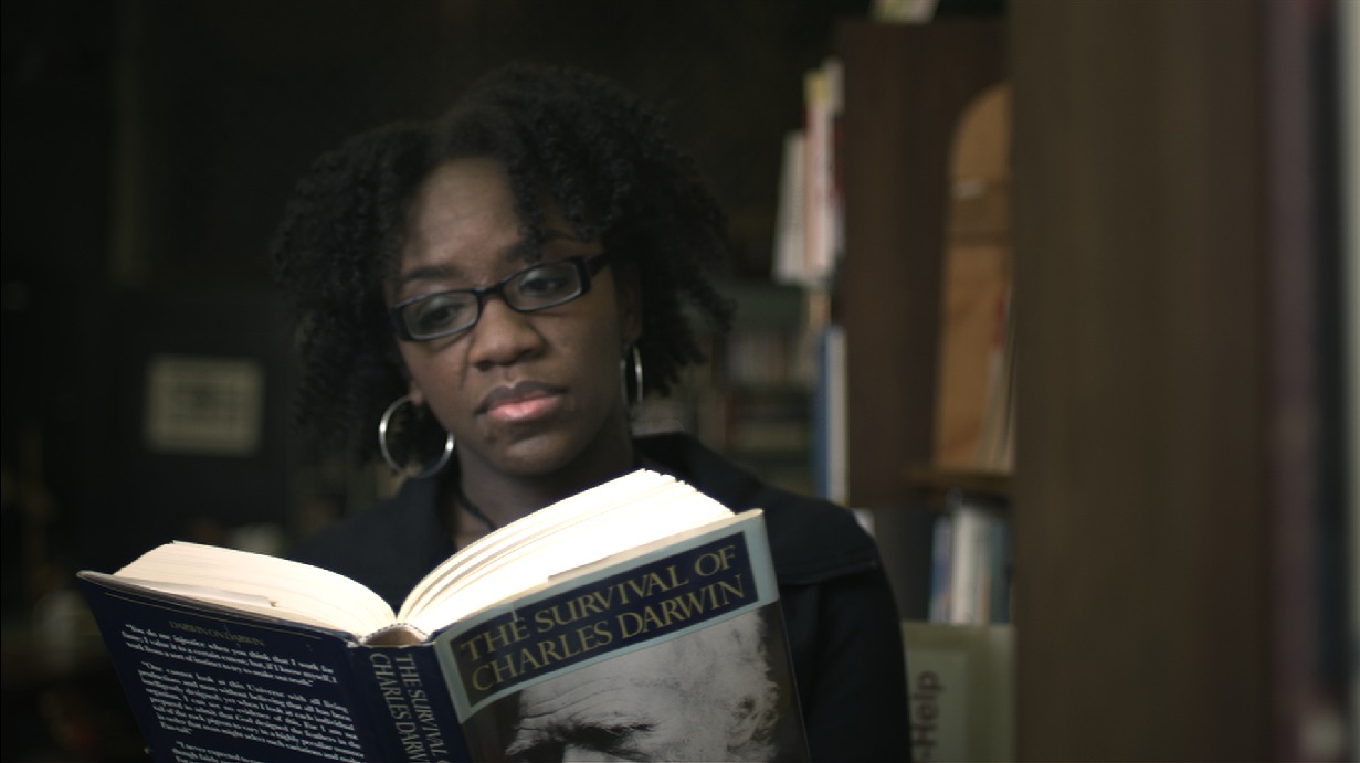
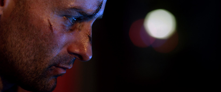
- The Purple BlockbusterHere's a look I did a good while ago (almost a year and a half ago), but it's remained one of my favorite looks I've done. I wanted to do a variation on the blockbuster look so the subject would...continue reading
- A “Low-Con” LookAnother grade breakdown, and this time back in Resolve. On a recent piece I finished (actually an accompaniment to the piece I did this grade breakdown for), I wanted to do a low contrast look. It actually ended up being...continue reading
- My “Apocalypse” LookContinuing the series of grade breakdowns I've started, here's a breakdown of a short I did several months ago (before I started using Resolve, so the downloadable look is for Apple Color). This is more of a high-contrast, gritty look,...continue reading
- The “Classy” LookOkay, I'm terrible at naming my looks, but here's a breakdown of a look I did for a TV commercial I finished last month. I was wanting to give the footage the feel of intelligence, subtlety, and class, so I...continue reading
- Colorist Tip #46 – Preparing LooksWell, today's tip will be this site's first Guest Post! Rob tweeted a great colorist tip the other day, so I thought I'd see if he'd like to expand it a bit for the site. Rob's a great colorist based...continue reading


