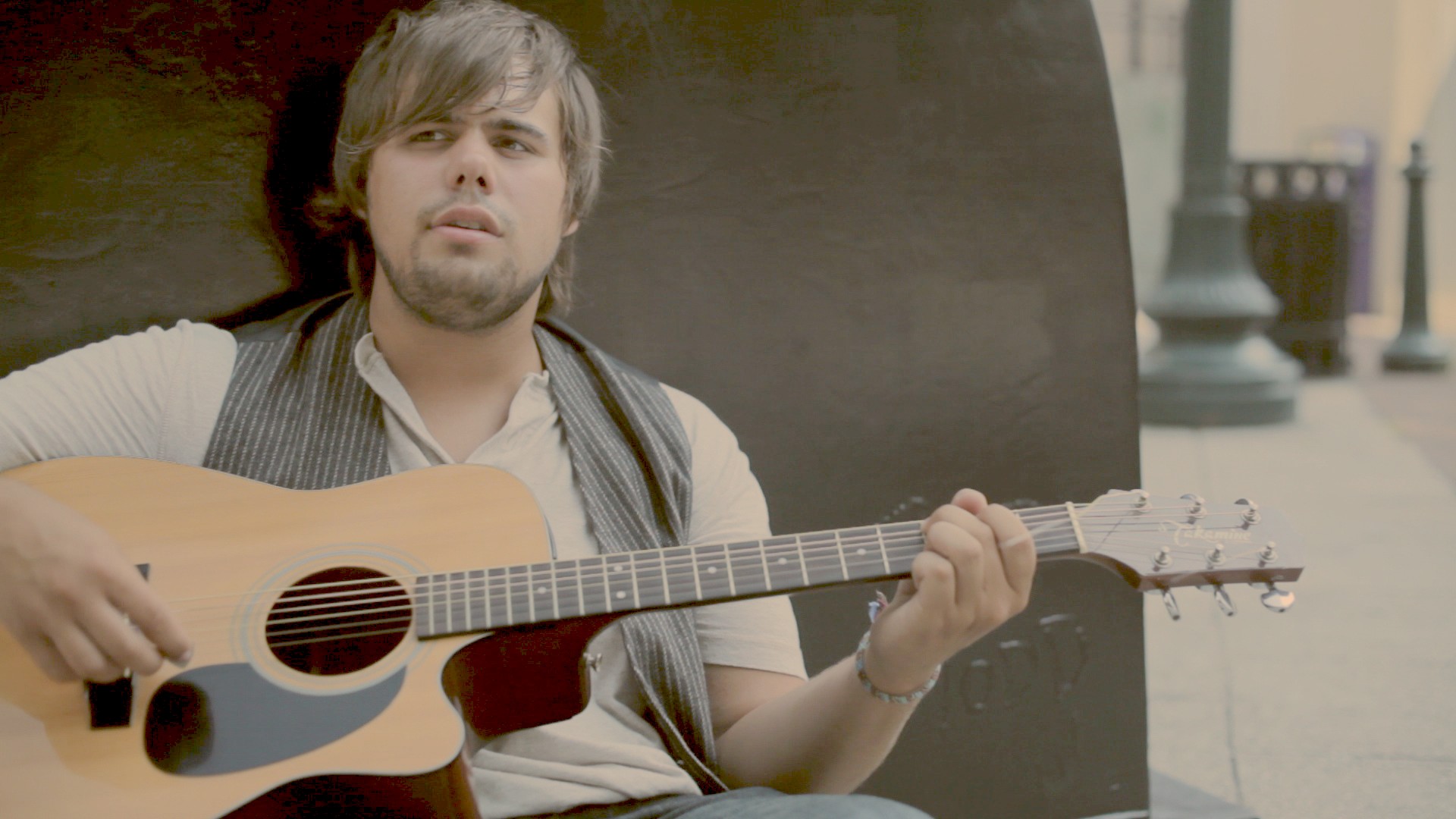
- Vintage Looks – Part 4For the last of the vintage look series, we'll work on a moody, rich red look. We'll start with this base shot: The balanced base image. Our first step is to crunch the miss - we want a darker, moody...continue reading
- Vintage Looks – Part 3For part 3 of this vintage looks series, we're going to look at a cross-processed look. A quick Google search of "cross process" gets the general idea across: green shadows, red or yellow midtones/highlights. We're not going to to quite...continue reading
- Vintage Looks – Part 2Okay, part 2 of the vintage look series is here! This is going to be a clipped, blue look. No Bigfoot this time, but he'll be back in the next look. We'll start with this image: The already-balanced starting shot...continue reading
- Quick Tip: ND Your ScreenOkay, here's a quick tip I was reminded of when Juan Salvo asked on Twitter about finding a GUI monitor that looked half-decent with the brightness turned all the way down. I saw that and remembered something pretty awesome I...continue reading
- A Faded Film LookThe look for this post is one I worked up for fun a while back when I was working on a freelance piece. I didn't end up using the look (I cooked it up just for fun; I was only...continue reading


