Okay, part 2 of the vintage look series is here! This is going to be a clipped, blue look. No Bigfoot this time, but he’ll be back in the next look.
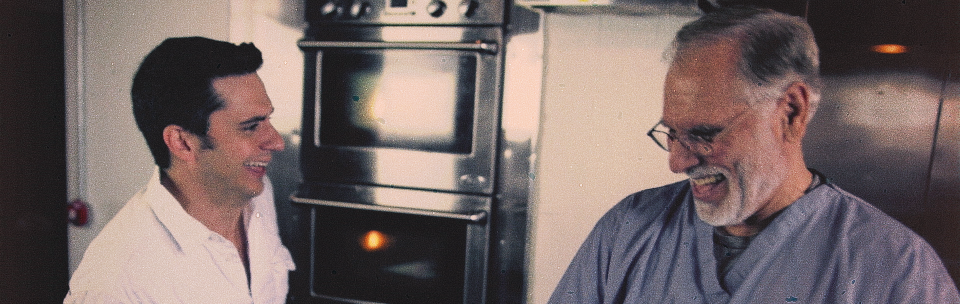
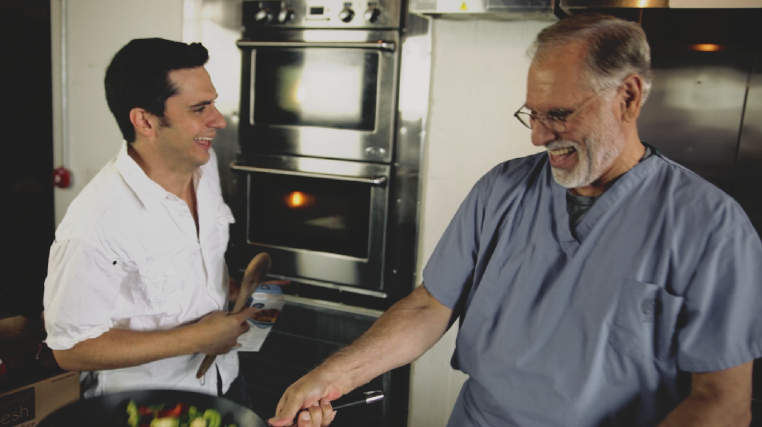
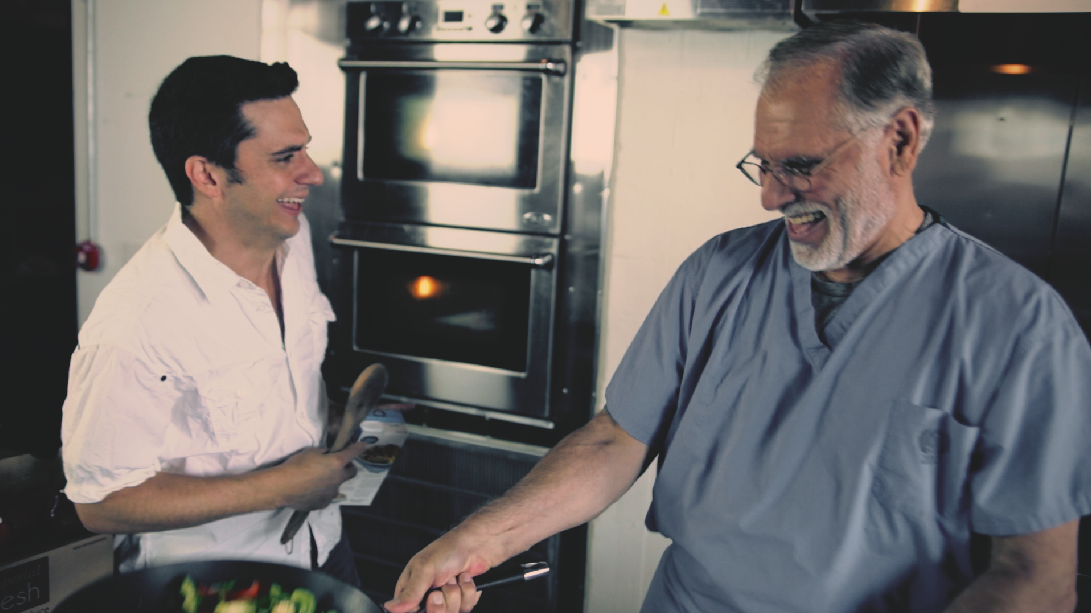
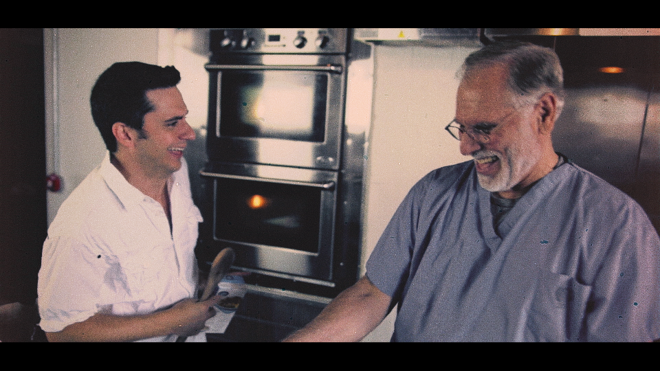
We’ll start with this image:
The already-balanced starting shot
The first thing we need to do for this look is hard-clip the shadows and highlights. There are a couple ways to do this, but adjusting the luminance curve is best since it leaves us free to adjust our other tools without interference. Add a hard stop to the shadows using the curves. It took an extra point to make it a harsher clip:

Clipped shadows (most noticeably in the oven and hair).
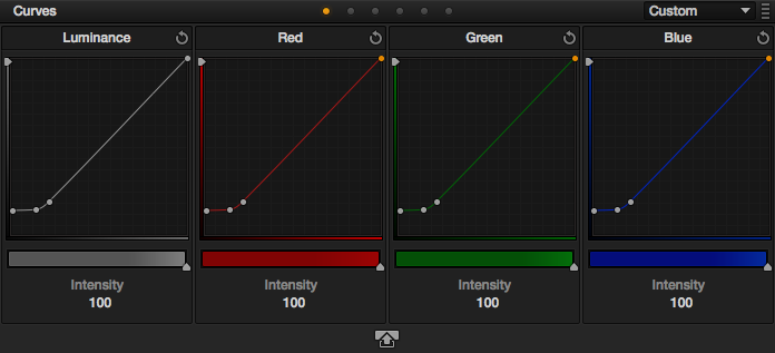
Hard clipped shadows in the luminance curve.
Now we’ll do the same thing in the highlight range:

Clipped highlights (most noticeable in the white shirt).
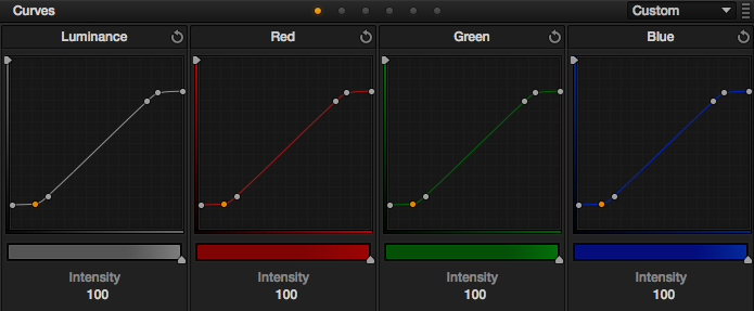
Again, it took an extra point to make it harsher.
Now, we want to really screw with the saturation to give it a faded look, but not all over. Switch to the Hue vs. Saturation curves, and really bring down the blues and surrounding tones, like this;:
It really knocks down the blue scrubs, but you can notice the effects elsewhere too.

It’s a harsher transition to the red range, and a smoother transition to the green/yellow range.
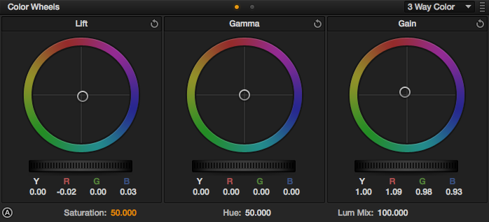
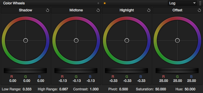
Now we’ll starting pushing some color around. We know we want this to be a blue look, so switch to the Log color wheels and push some blue into the offset:

A little overall blue to get us started.

A little blue/cyan in the offset.
Now that we’ve got a hue-base to work with, we’ll start tweaking it a little. Back in the 3 Way Color Wheels, we want to cool the shadows before we warm up the highlights. A little blue in the shadows:
Just a little does the trick.

Adjustments for the above.
Now we’ll use the highlights to bring the image back to a (somewhat) more natural tone in the walls and shirt:

Warm up the highlights
Adjustments for the above.
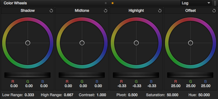
Okay, here things get a little unusual. We’re going to push the image further out of whack in the mids:

Yes, they are purple. I know, I know.

Some blue in the mids
Now switch back to the Log Color Wheels and we’ll pull some of that back. Why in the Log wheels? They have clearer distinctions between tones, so we can pull it back without affecting the other areas as much:

Better?
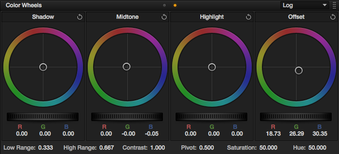
A little warmth in the mids.
We’ll add some warmth to the highlights in the Log Color Wheels too:
Warmer.
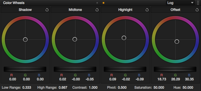
Some orange in the highlights
Now for a vignette. This one will use a different set of adjustments than I usually use for vignettes. Here are the window settings I used:

Not nearly as soft as I usually do, but this is intentional.

Settings for the vignette window.
Another change besides the softness is that we’ll stay in the Log wheels instead of doing the adjustments in the 3 Way wheels; we want that that harsher tone separation. We’re going to drop the highlights a bit:

Darken the highlights.
Note again that this uses the Log Color Wheels.
Then we’ll lower the mids:
Last step in Resolve…
Lower the mids…
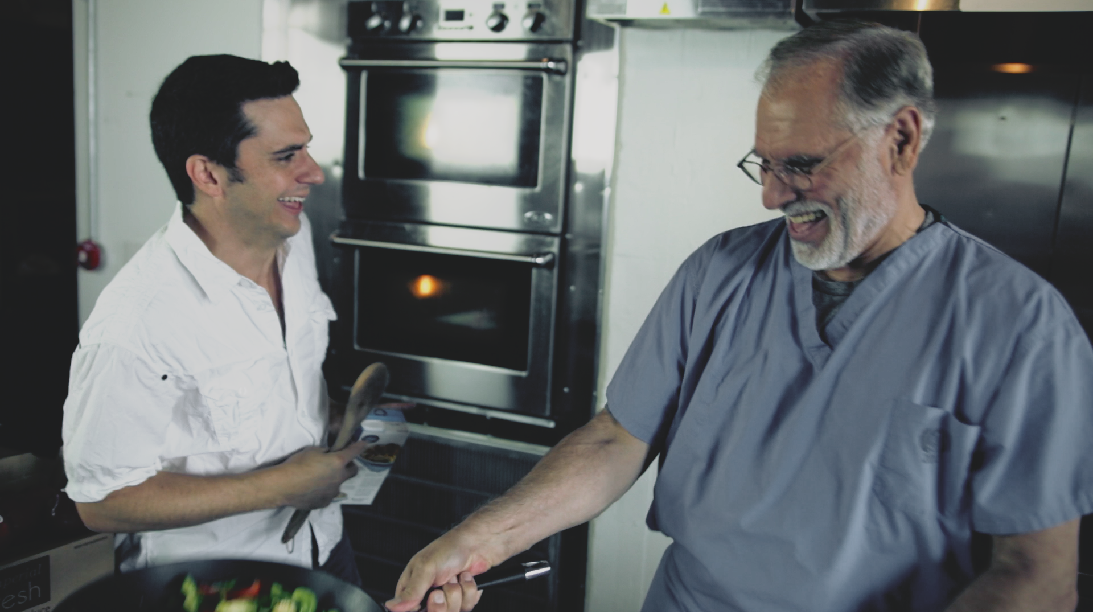
Here’s what the final node tree ended up looking like:

Node 1: Balance. Node 2: Look. Node 3: Vignette.
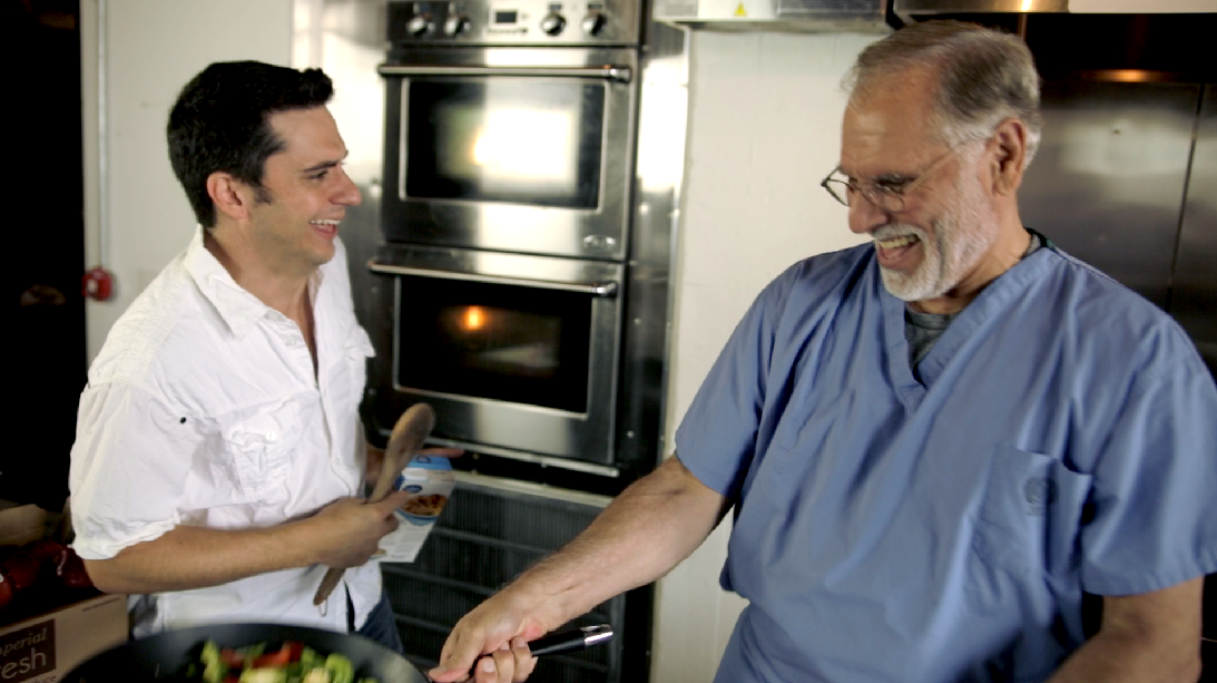
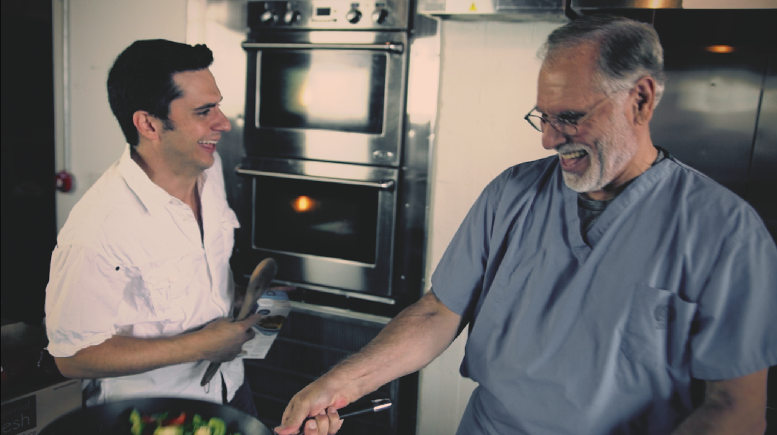
From here, I took the shot to After Effects and added a specific grain from Cinegrain’s “Looks” collection, and ended up with this as the final:
The final image, with a letterbox and film grain.
It’s worth noting that this look does some weird things with the skintones that you wouldn’t normally do. However, this look is designed to emulate an aged, over-processed, deteriorating film stock, so “correct” skintones would have faded with aging. It’s specific to this project’s “world”, but it works and cuts well with the rest of the piece.
Attached is the Resolve PowerGrade for this look. Append it after your first node (this PowerGrade does not include the first “balancing” node in the image above), don’t forget to adjust the first node you already had to balance your specific shot. As usual, feel free to use this look in your projects all you want, but please don’t share or distribute this preset. Instead, send them here to get it.


01/23/2015, 11:43 am