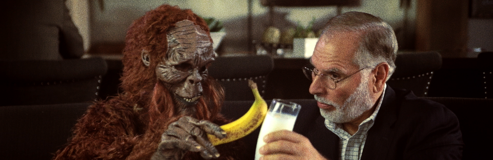
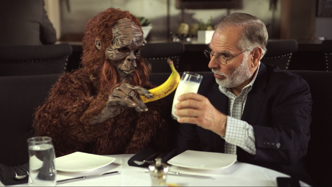
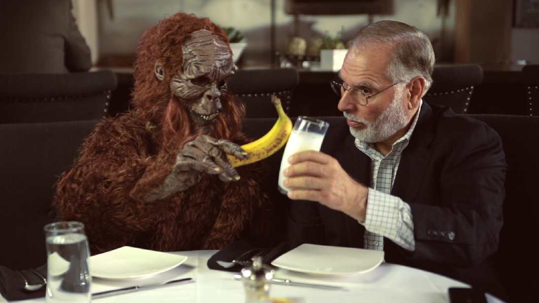
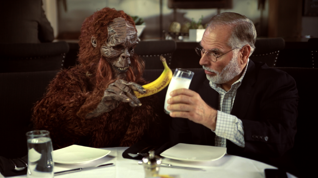
For the last of the vintage look series, we’ll work on a moody, rich red look. We’ll start with this base shot:

The balanced base image.
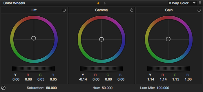
Our first step is to crunch the miss – we want a darker, moody look, and the mids are the first place to hit:
Darken the shot.

Adjusting the mids/gamma is the way to go.
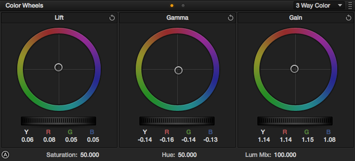
Next, we’ll try to pull some shadow detail back in by lifting the blacks:

Reclaim some of that shadow detail. Look specifically at the jacket detail.

Adjustments for the shadows.
We’re going to be fighting for detail in the shadows the whole time with this look, so keep an eye out for that – you want the shot dark but not completely crushed.
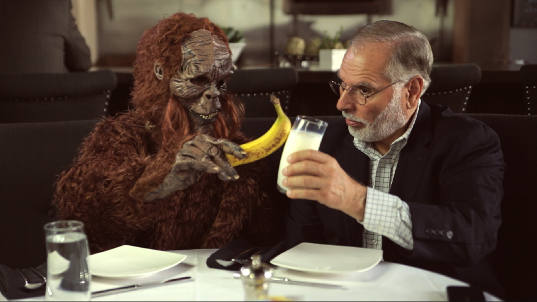
Next we’ll raise the highlights up:

Make the milk and the shirt look white enough.
Adjustments for the above.
Now we’ll start pushing some color into the shot. We want a rich red look, and the shadows are the best place to push that red without affecting the skintones too much:

Red in the shadows gets the hue across without making the subject look sunburnt.

A little does a lot…
We’ll push a warm tone into the highlights to enhance the red but still keep the skintones in acceptable ranges:
Warm the shot up a bit more.
Just a little…
We’ll use the mids to pull the shot back (standard push-pull technique) a little cooler, primarily focusing on the jacket – we want some color separation from the booth:
Pull a little of the warmth out to get the jacket looking a little cooler for separation.
Some blue/cyan does the trick.
We’ve got our separation, but we lost some of the red in the shadows. We’ll push the shadows a little warmer, but we want a tighter influence without spilling into the mids. So, switch over to the Log color wheels and push the shadows into the warm hues:
Warm the shadows up again.

A little warmth in the shadows.
Then cool the mids again :)

The Log color wheels affect a narrower tonal range with less overlap.
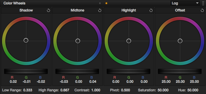
Adjustments for the above.
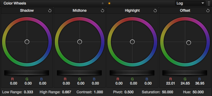
The shot just isn’t quite warm enough, so we’ll push the whole shot warmer in the offset control:

Warm the whole shot.

The offset affects the image as a whole. It’s great for white balancing, but good for this too…
No we need to do a major fix for this shot: the milk is yellow. Who wants to drink yellow milk?
We’ll pull a key/qualifier:
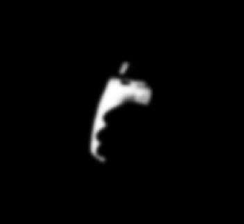
The key matte
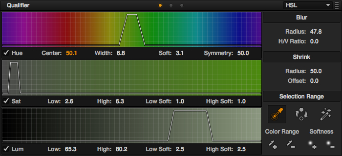
The key settings
And put a window around the glass to restrict any spill (I also tracked it as his hand moved…)

The milk window
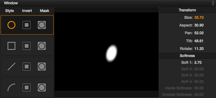
Settings for the window
All we need to do to “fix” the milk is push the offset towards the cooler hues:
Yay! White milk!
It took a pretty big adjustment to make it look white.
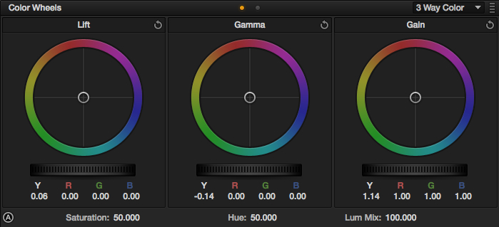
Our last step in Resolve is going to be a vignette around our subjects:

The window placement. Notice it’s not centered in the shot, but placed around our subjects near the top.

Settings for the vignette.
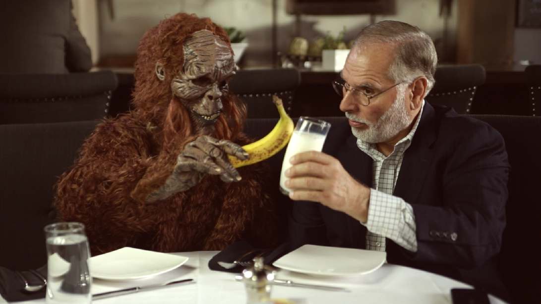
First we’ll crush the blacks a little:
Darken the edges
Blacks first.
Then we’ll lower the mids too:
We want it pretty moody, so it’s a strong vignette.

Adjustments for the above.
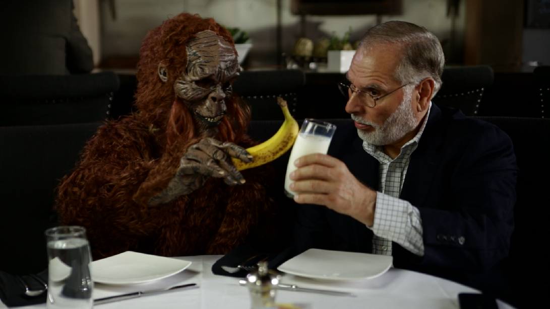
Last up, we’ll raise the highlights a bit so the table doesn’t get too dark:

The final shot from Resolve

Raise the whites a bit.
Here’s the final node structure in Resolve:

The first node is the primary balancing. The second is the look. the third is the milk fix, and the fourth is the vignette.
Like all of the previous looks, I took this shot into After Effects and added some Cinegrain goodness, letterboxed the shot, and ended up with this:
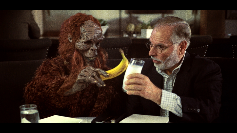
The final image.
Attached is the Resolve PowerGrade for this look. Append it after your first node (this PowerGrade does not include the first “balancing” node in the image above), don’t forget to adjust the first node you already had to balance your specific shot. As usual, feel free to use this look in your projects all you want, but please don’t share or distribute this preset. Instead, send them here to get it.
I hope you’ve enjoyed this vintage looks series! Let me know what other types of looks you’d like to see a series on in the comments. It just might happen!


08/23/2013, 4:47 am
Thanks Aaron.
I asked permission to post it on my blog
08/24/2013, 9:18 pm
Sure! Just make sure you link back to the original post, and please don’t copy the whole article – just summarize, link, and attribute. Thanks!
08/26/2013, 6:22 am
Ok, many thanks
10/20/2013, 11:10 am
Aaron, great post thanks. Any chance you might attempt an update to the ‘tricolour’ effect using Resolve 10’s improved RGB channel handling?
06/26/2014, 9:46 am