So, here’s something I’ve been playing with on a few small projects and having fun with: Triad color schemes used as a basis for color grading.
Triad Colors
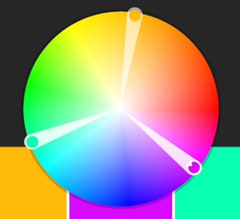
Triad color schemes are basically formed by picking 3 colors on a hue wheel that split the wheel into perfect thirds (for a more in-depth explanation, check here). Red, green, and blue form a triad, as do cyan, magenta, and yellow.
A great tool for coming up with triad color schemes is Adobe’s Kuler web app. It makes it pretty stupid-easy. Triad color schemes for a great color harmony for design, but they are actually pretty fun to play with for color grading as well!
Using Triad Color Schemes for Color Grading Looks
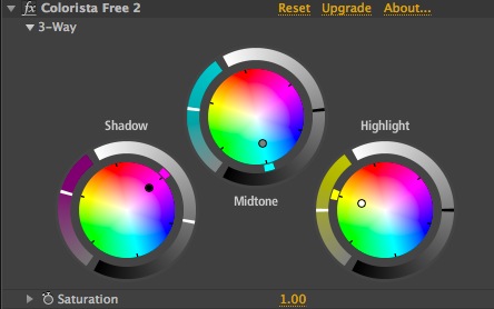
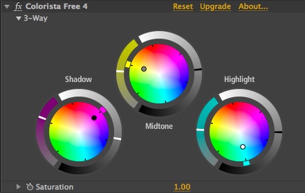
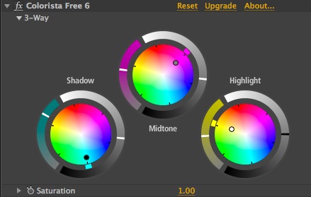
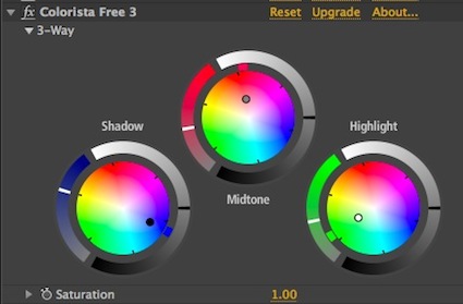
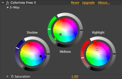
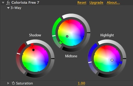
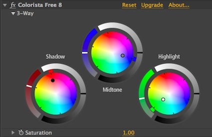
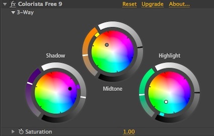
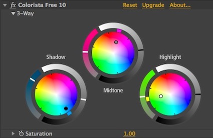
The concept is pretty simple, so rather than boring you with further explanation, here are several examples of it in action:
[divider]
[divider]
[divider]
[divider]
[divider]
[divider]
[divider]
[divider]
[divider]
These are just basic variations on the triad color idea, so they’re not necessarily useful in every circumstance, but they’re still fun to play around with, and some aren’t half bad. The whole idea of basing color grades off of graphic design color palettes has me intrigued. It’s almost a reverse of the Movies in Color Tumblr – picking the palette then grading.













07/09/2013, 10:35 am
Huh, that’s a cool idea. And you’re right—some of them aren’t that bad, actually look pretty cool.
07/09/2013, 1:05 pm
What if you think about this in a slightly different way? Don’t push the wheels in a triad, but instead play with Saturation/Lightness in a triad. Then just use your primary to get a good base. Of course, this relies much more on the colors in the original footage.
07/09/2013, 8:48 pm
That’s an interesting idea. Do you mean using using Hue vs. Luma and Hue vs. Sat curves?
07/10/2013, 9:11 am
Yeah. Like I said, though, it would be much more dependent on the source footage.