We looked over contrast in color grading in Part 1, and saw how it affects perceived sharpness and energy level. In this post, we’ll dive into contrast in editing, but first, a quick reminder on the definition of contrast and it’s 2 key points:
[quote_left]contrast noun |ˈkänˌtrast |
the state of being strikingly different from something else, typically something in juxtaposition or close association.[/quote_left]
Again, two important concepts from the definition:
- Strikingly different
- In juxtaposition
Part 2 – Editing
Contrast is less common of a term in the editing world (not counting when discussing color correction), but every editor is at least familiar with the concept of what I’ll call “visual contrast,” which is the difference between two shots. Wide shots, medium shots, close ups – editors need good visual contrast to, well, edit! Just like every rule is meant to be broken, there are appropriate times to cut between to very similar shots, but in general you want good visual contrast between shots to cut well between them. A so-called medium shot that actually isn’t much closer than the wide doesn’t create enough visual contrast to keep from and edit between the two feeling like an abrupt, awkward jump cut. It doesn’t need to be wildly different, but there is a point where it’s not different enough.
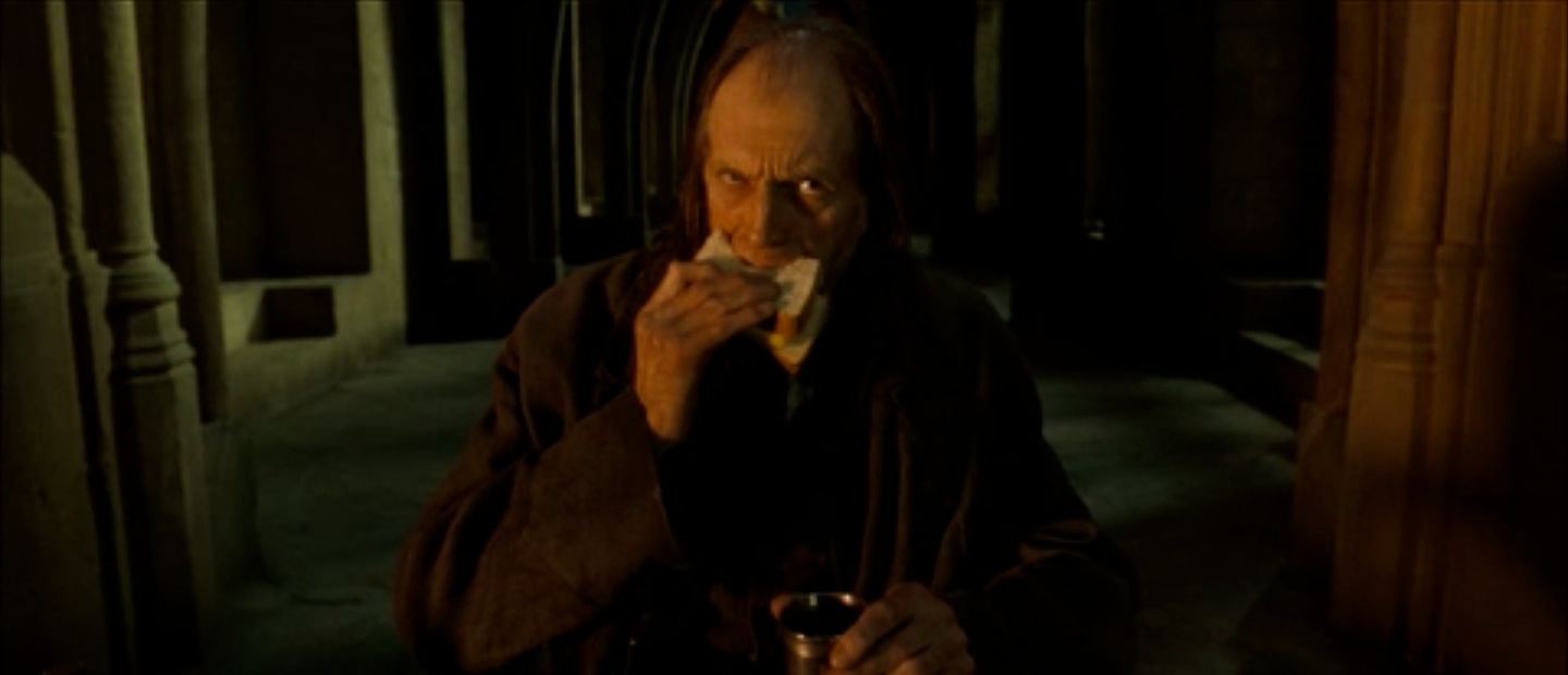
Not enough contrast between this shot and the following to cut directly between them…
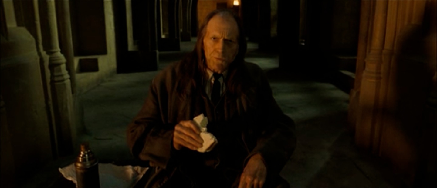
Cutting between these shots would have made an awkward jump-cut. Instead, the editor placed shots between the two.

A good medium wide shot to start…
Cut straight to this for impact.
Good visual contrast is really a tool in the editor’s arsenal to craft what great editors create so well: emotional contrast. On a small scale, most editors know the power of emotional contrast; cutting to that close up at the pivotal moment of decision for the hero so you can really see the actor’s emotion, or cutting to the wide shot right when the smart-mouth realizes that the boss he’s been bad mouthing just entered the room, every editor knows how to bring attention to key moments. The stark difference (see key point #1 above) between what was going on and what you just cut to lets the audience know that something important is happening. It’s time to pay attention.
On a large scale, an experienced editor knows how to use changes in pacing, juxtaposition of framing, music, speed, etc. to create emotional contrast between shots, scenes, and sequences. If you’ve been watching a fast paced birthday party scene, and all of a sudden the scene changes to a much slower cut conversation between the protagonist and his wife at the end of the picnic table, you know something’s up. The editor used the juxtaposition (see key point #2 above) of the pacing to bring emotional weight to their conversation, even though the characters are technically in the same place. A great example of this within a scene is the final duel between Johnny Ringo and Doc Holiday in Tombstone:
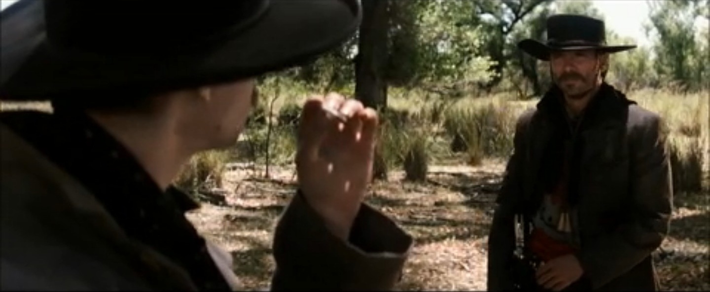
A medium shot OTS to start ramping up the tension as the duel gets serious.
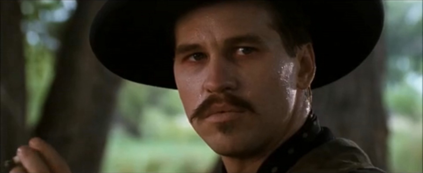
Cut to a close up of Doc.
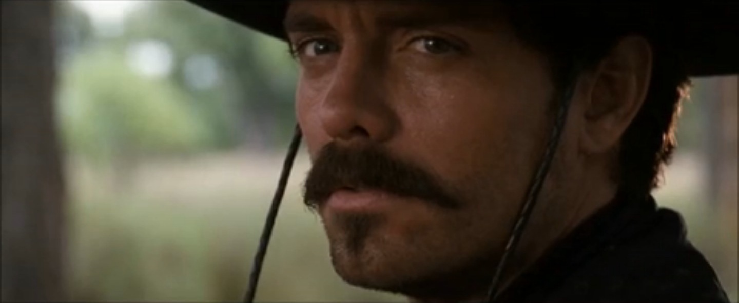
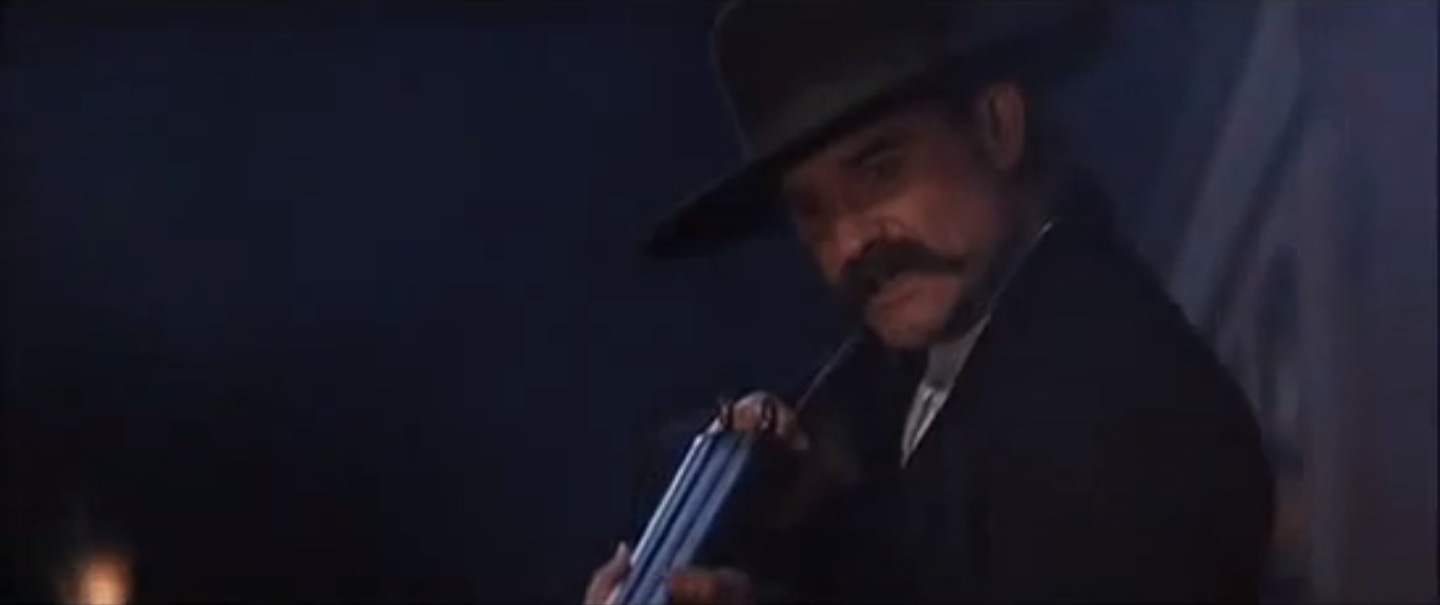
Cut to an even tighter close up of Ringo.

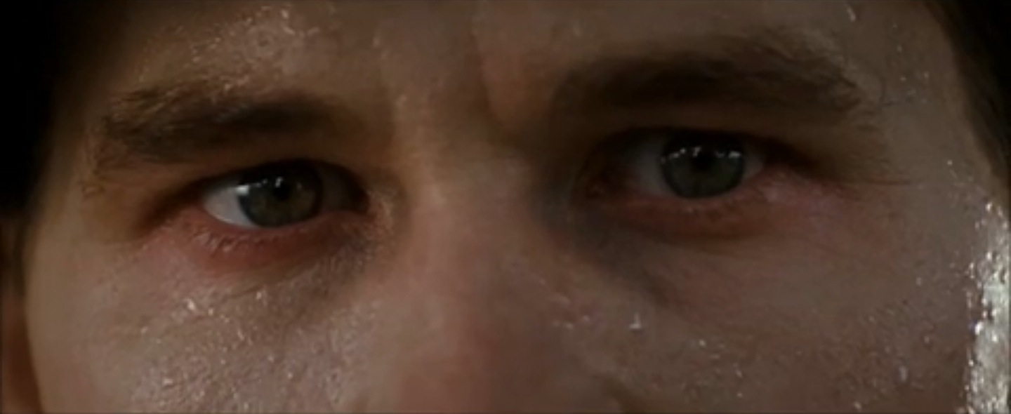
Cu to an extreme close up of Doc…
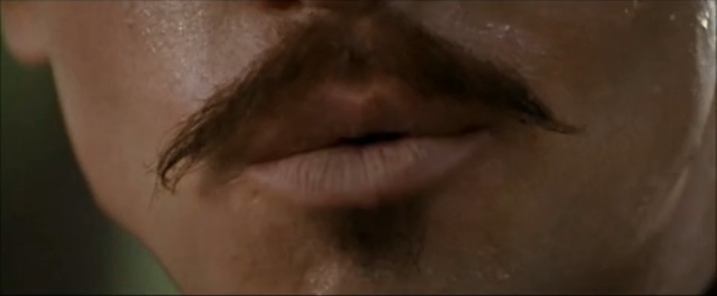
Tilt down to an extreme close up of Doc’s mouth as he taunts Ringo…
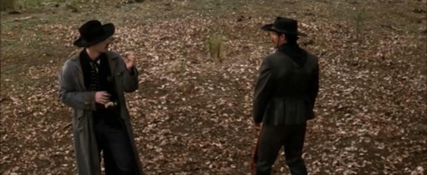
Then cut to a wide shot of the whole duel. This contrast adds serious weight to Doc’s quip, and let you know it’s about to go down.
Watch the whole scene below:
http://www.youtube.com/watch?v=sluJswluQWc&t=1m34s
A great macro example of using editing and fantastic pacing over multiple scenes to create emotional contrast: The Dark Knight. From the point where the manhunt for the Joker begins and Wayne gives Lucius control of the cellphone imaging device, the pacing of the edit steadily increases, climaxing with the decision of the ship passengers not to blow each other up (great use of close-ups) and Batman’s battle with the Joker. After Batman finally overcomes the Joker, the pace slows down considerably, lingering on the shots as the Joker reveals his “ace in the hole” with Dent. After that, we move to another dialogue scene between two people (Gordon and Dent), but this time the pace is different. Shots and reaction shots move by quickly compared to the scene before, even though it’s still mostly just dialogue; the frantic pace emphasizes what’s at stake: both Harvey Dent’s and Gotham’s very souls.
To be fair, a lot of this comes from the cinematography (see Shane Hurlburt’s great series on Storytelling Through Composition: Part 1 and Part 2), and the score only heightens this, but the editor knows when and how to use these shots and set the pace for maximum emotional impact. That beautiful closeup in the wrong place – maybe used too soon or too often? Boom. Impact destroyed. Too quick of a pace before the climax? That leaves you nowhere to go. Good editing makes it work.
Our next area to explore contrast is IMAG. You can think of IMAG as editing on the fly, so some of these concepts transfer over from editing to live video directing. Look for it next week!


02/25/2013, 8:49 pm
Good article Aaron.
Thanks
02/27/2013, 9:38 am
Thanks!