
Let’s talk a little bit about contrast. The dictionary defines contrast as such:
[quote_left]contrast noun |ˈkänˌtrast |
the state of being strikingly different from something else, typically something in juxtaposition or close association.[/quote_left]
So, two important concepts from the definition:
- Strikingly different
- In juxtaposition
Contrast is a hugely important part of filmmaking (and storytelling in general). In this post I’ll be applying this concept in a few ways to color grading, editing, and IMAG, in practical applications you can use in your work. Let’s start with color grading.
Part 1 – Color Grading
Contrast is a pretty common term in color grading. Make your blacks blacker, your whites whiter, crush, crunch, stretch, etc. Color grading probably deals with contrast directly far more often than most filmmaking areas.
What effect does image contrast have on the viewer? Well, first and foremost, contrast affects perceived sharpness. That Sharpness filter you see in your NLE, Photoshop, AE, Color Grading Program, etc. – it increases contrast specifically around edges (kind of like an edge-detect filter’s results used as a matte for a contrast adjustment).

Before sharpening

After sharpening
Look at a closeup of the finger. notice how the sharpening filter defines the focus by increasing contrast right along the edge. Use too much of this filter and you start to see the fringing or halo effect where it’s increasing contrast so much that you get a noticeable bright outline around your subject.

Before sharpening
After sharpening
So, great. Contrast affects perceived sharpness. Whoopdi-doo. How can that help you?
On the practical side, you can use contrast adjustment along with a little bit of sharpness to make slightly out of focus footage useable. It doesn’t always work, and this does lock you in to a higher-contrast look though, so be aware.
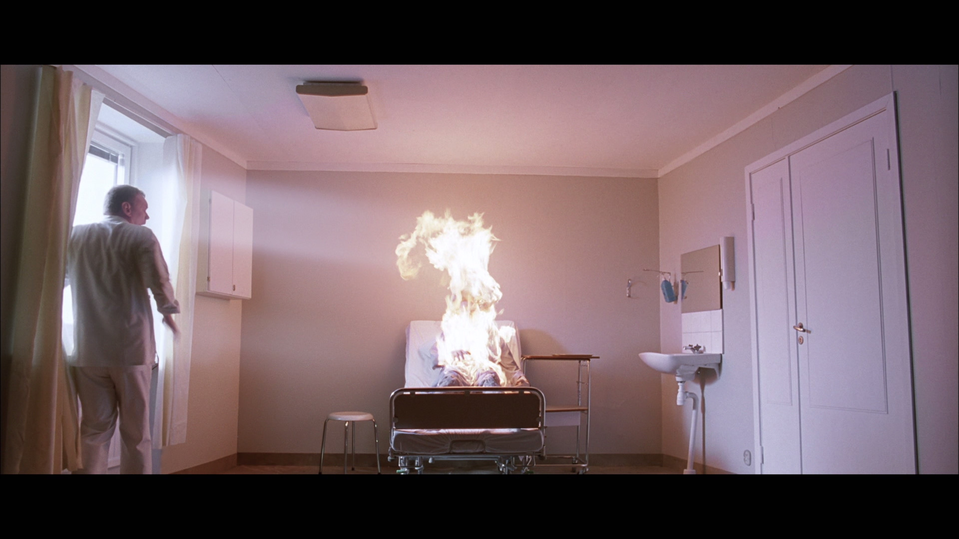
On the (infinitely more fun) storytelling side of things, it gives you a number of options for setting the mood. Often, it’s what the audience can’t see that creates tension. Noir films used this to great effect with the ultra-high contrast by creating blacks so deep the audience just knew someone had to be lurking in the shadows. It works the opposite way as well. If contrast affects perceived focus, a low contrast look can make things murky and hard to make out, achieving the same imminent but hidden threat as the deep shadows in the noir. Horror/suspense films use this well, though it often involves the addition of haze or fog as well (see The Others or certain scenes in Predator for example).

The Others
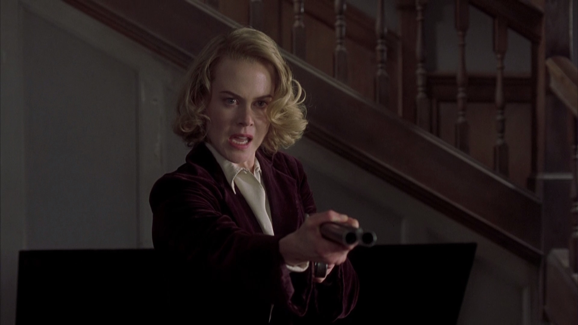
The Others (again)
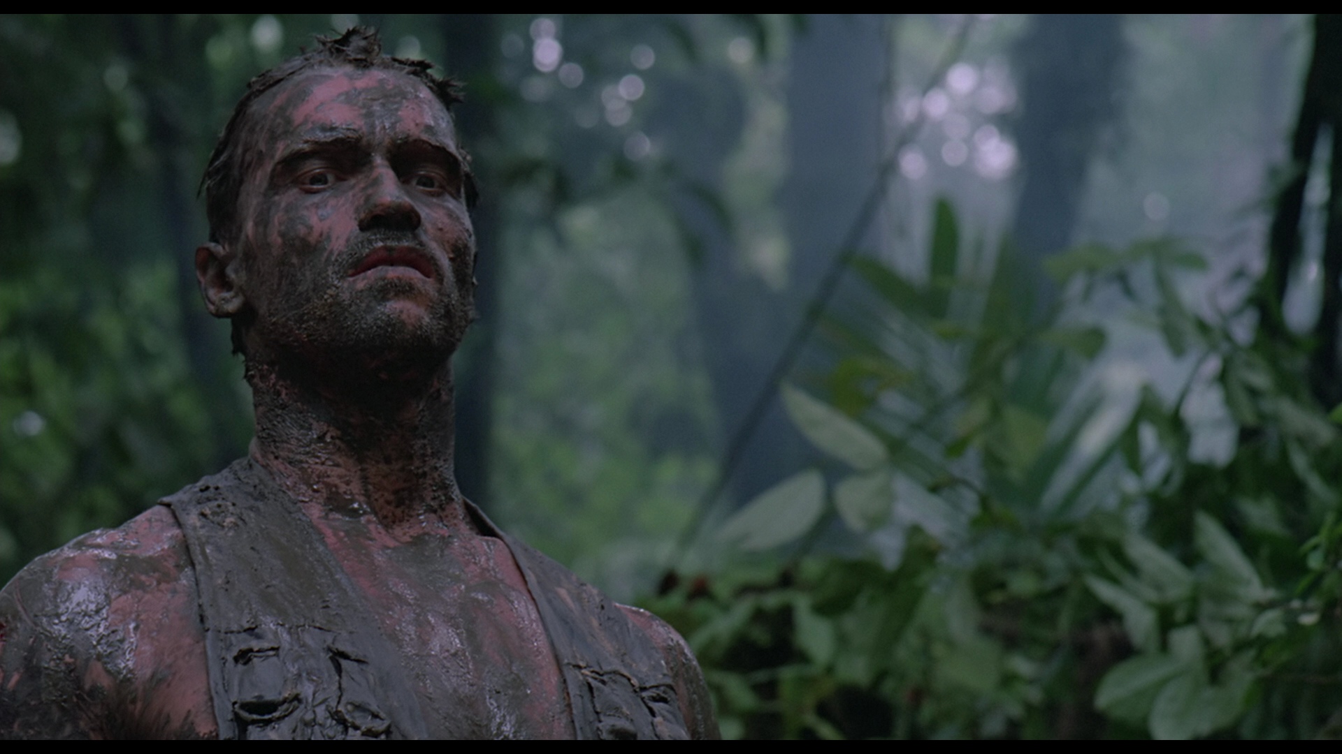
Predator
Low contrast can also be used for dramatic films to great effect. High contrast adds energy (we’ll discuss this in a bit), so a lower contrast look can add an air of mystery or cause your audience to slow down and think. Lots of examples for this one:
Where the Wild Things Are
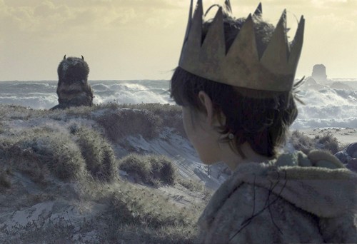
Where the Wild Things Are (again)
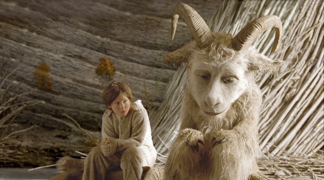
Where the Wild Things Are
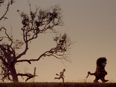
Where the Wild Things Are (and kudos to my beautiful wife for thinking of this example during my research phase)
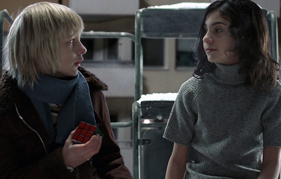
Let the Right One In
Let the Right One In (again)
We’ve already discussed how high contrast looks add tension; High contrast looks also add energy. Things that are out of focus are still well defined by the extra contrast (perceived sharpness!). This lack of the unseen or unidentifiable makes the viewer hyper aware of the environment and puts them on the edge of their seat. Big-budget summer action movies? High contrast. Slasher horror films? High contrast (and usually high key lighting as well). What’s the common thread? Lots of running. Lots of quick cuts. Lots of energy. This isn’t isolated to these two genres, but it’s where it’s the most prevalent.
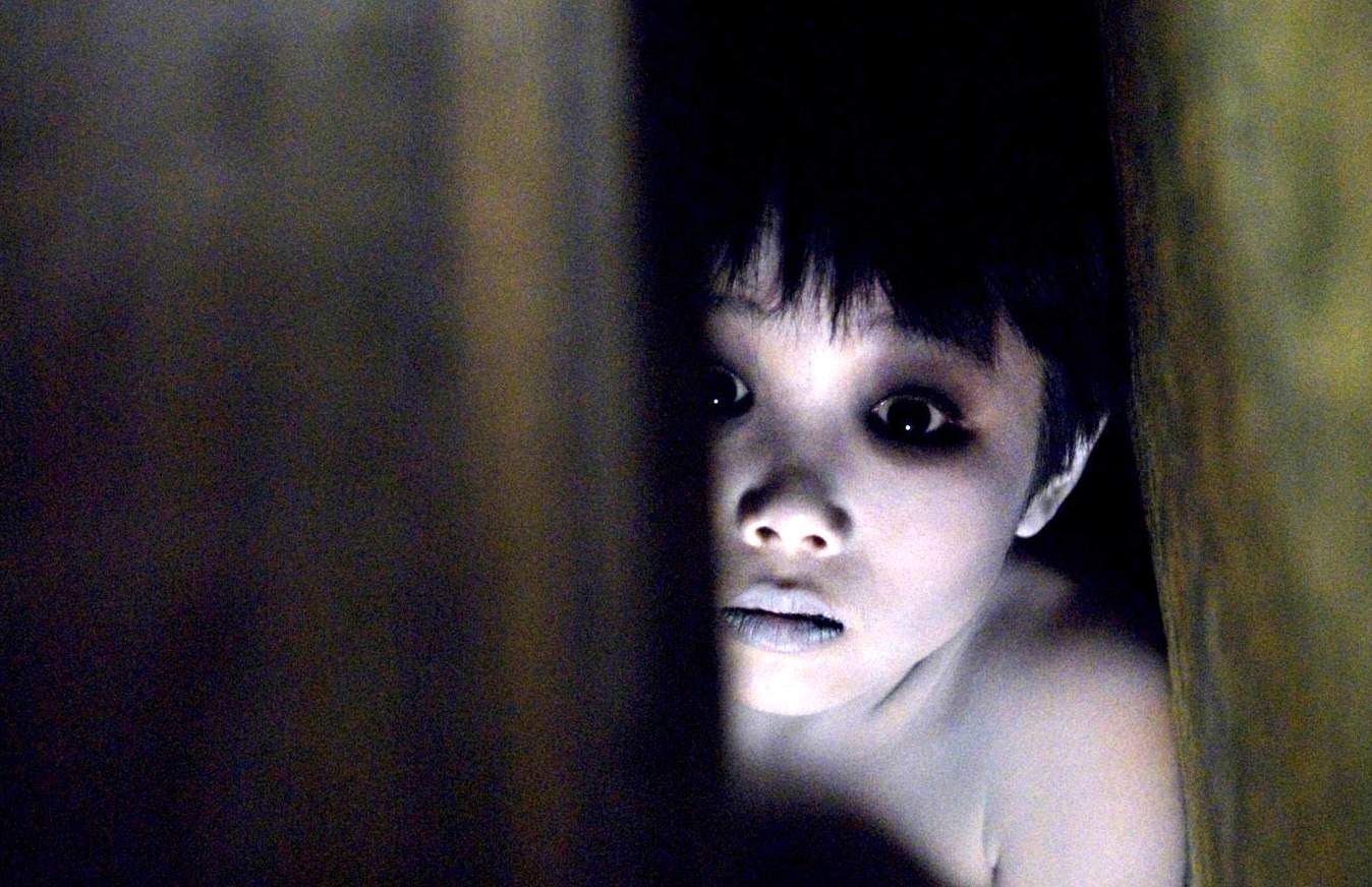
The Grudge
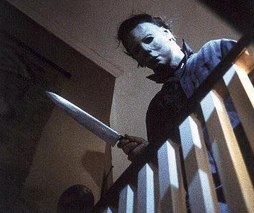
Halloween
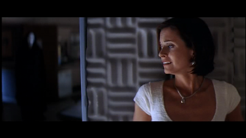
Scream

Texas Chainsaw Massacre

Live Free or Die Hard
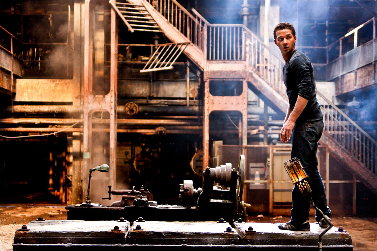
Transformers
There are a lot more implications of low contrast and high contrast looks in color grading (contrast’s affect on perceived saturation for example), but this is just one fun way to think about contrast when grading. Stay tuned for part two: contrast in editing.


02/19/2013, 10:43 am
03/14/2013, 7:00 pm