Continuing the series of grade breakdowns I’ve started, here’s a breakdown of a short I did several months ago (before I started using Resolve, so the downloadable look is for Apple Color). This is more of a high-contrast, gritty look, so I’ll call it my “Apocalypse” look.
We’ll start with the ungraded shot:

The raw, ungraded image.
We’ll start off by doing a quick balance. This shot looks just a bit blue-gray, and the skin tones are a little paler than in real life, so we’ll push in a warmer tone in the highlights.

You’ll notice I also raised the highlights a little.

adjustments for the primaries to balance the shot.
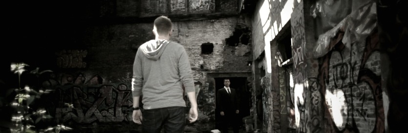
Now we’ll start on the look. I want a really high contrast look, but not too saturated. It’ll end up looking very similar to a bleach bypass, but we’ll go about it in a slightly different way. First we’ll crush our blacks a bit to start on the high contrast:

We’ll lose the suit into the shadows for now, but we’ll get some of it back in a sec.

Adjustments for the above.
Now we’ll raise the highlights to get the suit back and have a little bit of overexposure on the sunlight hotspots.

The sunlight hotspots are intentional in this look to accentuate the “harshness” I’m going for with this look.

I raised the highlights quite a bit…
Now we’ll lower the mids to add back in a little more contrast. I want to only retain a little of the shadow detail on the suit. He’s sinister character, so I want him to exude darkness.

Leaving detail on the suit just in the shoulders gives his body a good frame of reference, but still lets him blend into the darkness.

The mids came down a good bit too while I watched the shoulders of the suit.
Now we’ll start adding color. I want a dusty sepia-ish tone, but not all in the same tonal area, so we’ll push some red orange into the mids:

A little on the red side for now…

Adjustments for the above.
Now we’l pull the shot back to a sepia by pulling some color into the shadows:

Pulling in color in the shadows offsets the red in the mids.

After some experimenting, green actually ended up being the color to offset the red in the end.
Now that we’ve finished that, we’ll do a good deal of desaturation, but I want that in a new secondary for control:

Very desaturated!

3/4 of the day to black and white!
The last part of the look will be a vignette around the edges:

Part 1 of the vignette – the shadows.

A big, soft window for this.

Pull down the shadows some. Notice I’m “outside” the window/vignette.
Now one last step, and one that I don’t normally do for edge vignettes. Normally I just increase contrast on the edges through the shadows and mids, while leaving the highlights alone. This time i’ll drop the highlights pretty dramatically on the edges.

Bringing down the highlights a good bit.

The final graded shot. Bringing down the highlights on the vignette has the added effect of knocking down the overly-bright plants on the left side.
Here are a few other examples of shots from this short with the look applied:

Before

After

before

After
If you want to see it in action, here’s the final piece (produced for my full-time job at a church):
Attached is the Apple Color secondary for this look. You will probably have to adjust this for your shot, but it should work as a good base. As usual, feel free to use this look in your projects all you want, but please don’t share or distribute this preset. Instead, send them here to get it.


