Another grade breakdown, and this time back in Resolve. On a recent piece I finished (actually an accompaniment to the piece I did this grade breakdown for), I wanted to do a low contrast look. It actually ended up being a low-contrast-low-saturation look, but here’s how I made it.
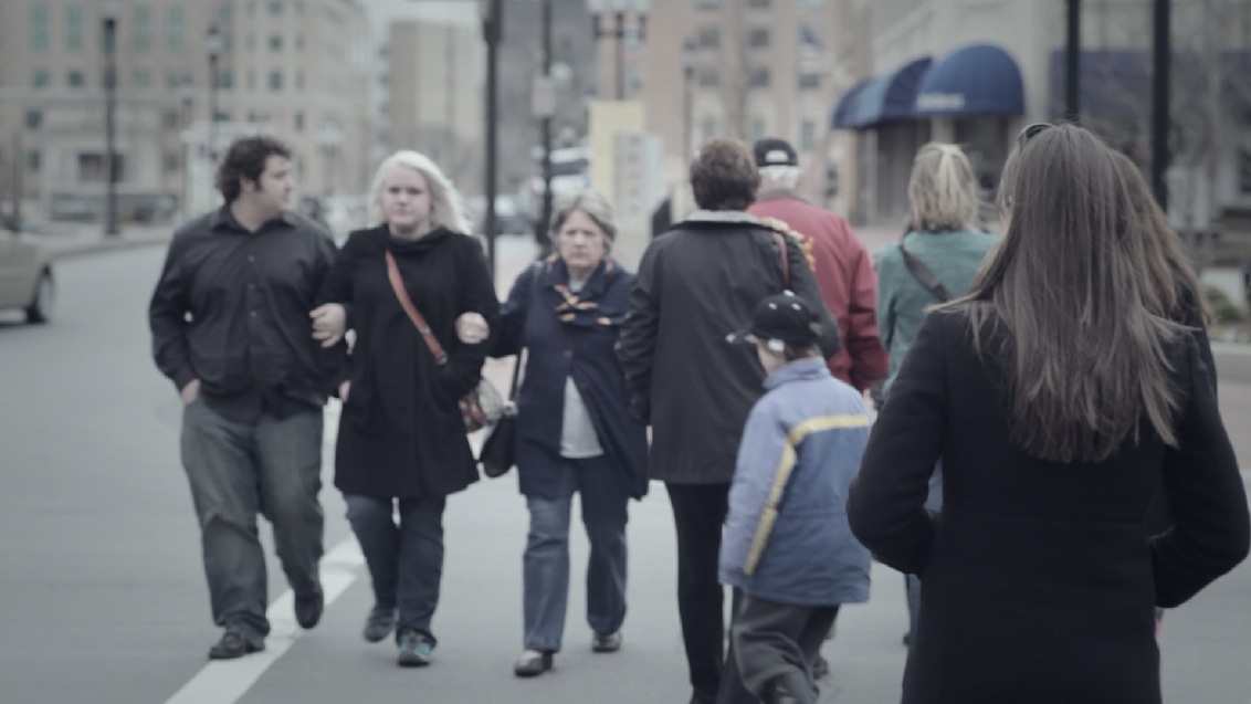
We’ll start with a balanced shot:

The balanced image.
The first thing we’re gonna do is lower the saturation by a little over half:

Lower saturation also gives a feeling of low contrast, even though we didn't touch any of the highlights, mids, or shadows.

Adjustments for the above.
Now, to start on the actual low-contrast look, the first thing we’ll do is raise the shadows:

Raising the shadows has the biggest impact in this look.

Adjustments for the above. Look in the shadows area.
Next step is to hit the mids:

We want to add just a little contrast in the mids so there's still some perceived sharpness, but the blacks are still a little milky.

Lower the mids just a tad bit. I also touched the highlights a little, but almost an insignificant amount, so I merged it with this section.
Now on to a sight color cast. I want a faint sense of coldness, so We’ll push some blue into the shadows.

Just a little colder than I want, but we'll pull it back in a second.

Because the shadows are lifted they take the color very well, so it takes just a touch.
Now we’ll pull it back a little in the mids:

A little warmer.

It's not technically a pull (since it's not the opposite hue), but I want the shot a little warmer, so I pulled in some red.
Now just a touch colder in the highlights:

Last part of the color cast.

Just a touch of blue in the highlights.
Last step – an edge vignette:

Nice soft window on a new node.

Settings for the window above.

Different from the vignettes I typically use, this one only affects the shadows a little (since I want low-contrast blacks). Most of the adjustment is in the highlights.
Here’s the final image, followed by a few examples of this look on other shots:

The final look

Before

After

Before

After

Before

After
I know this is a quick, simple look, but it works well on a variety of shots (mostly due to the low saturation which counters bad color casts).
Attached is the Resolve PowerGrade for this look. Append it after your first node, don’t forget to adjust that first node to balance your specific shot. As usual, feel free to use this look in your projects all you want, but please don’t share or distribute this preset. Instead, send them here to get it.


08/28/2012, 5:40 am
Nice. Most of my clients want the “crisp” tv look – but i like the “floating blacks” very. But most of the tv stations don’t accept this look – the black must be on zero (europe). It’s a shame.
04/17/2013, 2:34 am
Here’s a preset for Premiere Pro that’ll give you the Low Con look
http://justfilmwhatever.blogspot.com/2013/04/the-low-contrast-look-premiere-pro.html