While the Luminance Curve doesn’t have as many practical uses as the others, it is particularly good at sky adjustments. To darken or add contrast to a sky, it works a little better than a key because you can build in smoother tolerances.
In my experience, I don’t use the Luminance Curve very often, and haven’t found many practical applications like the other curves, with one exception: skies. Since skies tend to be a range of blue-ish hues, the luminance curve is actually a very effective way to brighten or darken a sky with smoother roll-off and less noise than a key might. Here’s an example:

The base image
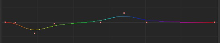
First, we’ll look at darkening the sky. Just add points on either side of your blue range, add another in the middle and pull it down, but just a little (be gentle…)

The curve

The effect - a contrasty sky
Here’s another quick example where I brought the sky up a bit (and since the grass is mostly tan/yellow, darkened it down to add more contrast making the sky seem really bright!)

The curve

The effect
The big advantage of this method over pulling a key is that with a key, it won’t always pick up the full tonal range of a sky, and the variations and tolerances can make the adjustment noisy. With the curve, you taper off the effect with the two points on either side, so it’s a smoother adjustment.


02/22/2011, 7:36 am
Hi,
I Actually followed this method when doing a test and found that i could make the grass look like flowers were blossoming from it. Very cool looking effect.
03/07/2011, 10:27 pm
Nice! Any use for the luma curve is unique, since it’s so finicky.
10/27/2013, 11:23 am