The saturation curve lets you adjust saturation for a range of hues using control points. Isolate the hue, then pull up/down. It’s particularly useful for affecting multiple colors/hues in a single secondary.
The best way to describe how this works is to show you:

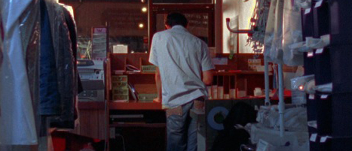
The starting image
The saturation curve work by using control points to pick/isolate different hues, then you move the selected hue up and down to increase or decrease saturation.
In this image, the yellow on the wall is really bothering me. I could use a key and pull it down that way, but for this example we’ll use the saturation curve. We’ll start by putting points on either side of the hue that we want to select to keep the adjustment from affecting the other hues. Then we’ll put a point in the middle of what we want, and pull it down to decrease the yellow hue:

The curve

Much better!
You’ll notice in my curve that it took multiple points to get the curve right. Each point has an influence on the area around it, so sometimes it takes extra points to keep your adjustment from affecting the colors around it.
We’ll keep going by pulling down the vivid blue as well on another secondary:

Pulling down the blue as well

Effects of the above
The great thing about the saturation curve is that you can actually effect multiple hues in multiple ways on the same curve. We can combine both of the above changes into one curve, and just to demonstrate the concept, we’ll pull the saturation of the red up to make it more vivid, while still pulling down the yellow and blue, but all in one secondary!

Yellow down, blue down, red up - all in one curve!

All this in one secondary...ZOMG that's AMAZING!!!!!!!...okay maybe not that much, but still pretty cool.


