In Apple Color secondaries, there are three views for window or key selections – the final output, isolated color, & the matte. The matte view is probably the most useful of these for fine tuning keys because you can see noise, spots, etc.
When finessing or viewing a key (or a window), the three views all have different uses. To change your view, you click on one of the three sets of colored rectangles to the right of the matte and window controls:

Look on the far right for the 3 sets of colored rectangles
The Red-Green-Blue set basically show you the output of the key and any adjustments you’ve made. If you haven’t made any color adjustments, you won’t see anything (like this shot – I pulled a key but haven’t made changes yet, so the output view still shows the original image):

If I start making color adjustments, I can see the final result here. No adjustments, no change, even if there is a key or window.
The Gray-Green-Gray set is the isolated color view (not sure what the official term is, but this works for me). It doesn’t show any color adjustments you make. Instead, it desaturates everything that you don’t have selected. In this case, I keyed the sky, so everything but the sky is black and white:

Blue sky that I keyed, with the rest black and white
This view works best to look at softness/tolerance of a key (it also works better when keying a very saturated color. See how it’s hard to tell how much of the sky is keyed since it fades to white?).
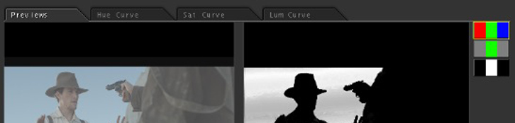
The isolated color view is okay, but I find the matte view much more useful in daily work. The Black-White-Black set turn on this view. The matte view makes what you have selected white, what’s not selected black, and what’s partially selected various shades of gray (just like an alpha matte in After Effects, Shake, Nuke, etc.):

Matte view - the best view for fine-tuning keys in my opinion.
The mate view is my favorite because I can see where a key is noisy, spotty, what I’m missing if I’m pulling for a desaturated source (unlike the iso color view), rough edges, etc. A quick comparison to the original image and I know all I need. This is also a view you’ll find in most coloring apps like Resolve, Lustre, etc. so you can pretty much count on it being there.
One thing to note is that these views work for keys, but also for windows, and even windows and keys together, like in these examples:

A quick, soft window

Iso Color view with a key and a window

Matte view with a key and a window


