Duotone = First make a black and white image, then push color into the mids only. A tritone variation would be black and white with two different (usually opposing) colors in the shadows and highlights only.
Duotone isn’t a look that’s used a ton today, but it’s still a good look/technique to know how to use. A duotone is a technically a printing process that uses 2 colors – usually black and one other, but the same concept applies to film, and it was a pretty common look in vintage films.
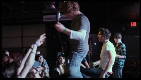
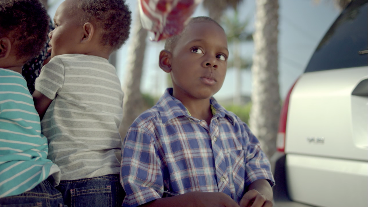
To make this look, let’s start with the base, balanced image:
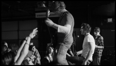
We’ll start in secondary 1 by lowering the saturation to 0, making a totally black and white image:
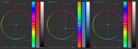
Next we’ll move to secondary 2. Push the color you want into the mids only. I chose blue to simulate a blue-toning darkroom technique like in professional photography:
It may seem like a simple technique, (and it is), but it this is how you get that “vintage” standard, sepia tone. Just push the color warm instead. It also works great for infra-red vision and other “alien” visions, as well as high-tech security cameras (mostly B&W, but push a little green into it), etc.
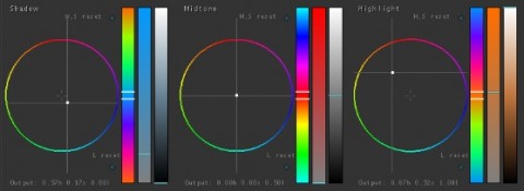
A variation of it is the tritone. Instead of pushing the color into the mids, try pushing two opposing colors into the highlights and shadows, and leave the midtones alone:
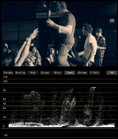
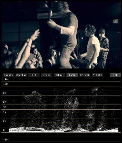
One side effect, since you’re pushing color into the shadows and highlights, is that your blacks are likely to get a little milky and your whites a little dull (see the waveform above), so bring up the contrast to get good levels:
Here are a few variations of the duotone:
Attached is the Apple Color secondary for this look. Secondary 2 is the duotone look, just push the mids to whatever color you want. Secondary 3 is the tritone look in case you want that instead. As usual, feel free to use this look in your projects all you want, but please don’t share or distribute this preset. Instead, send them here to get it.

