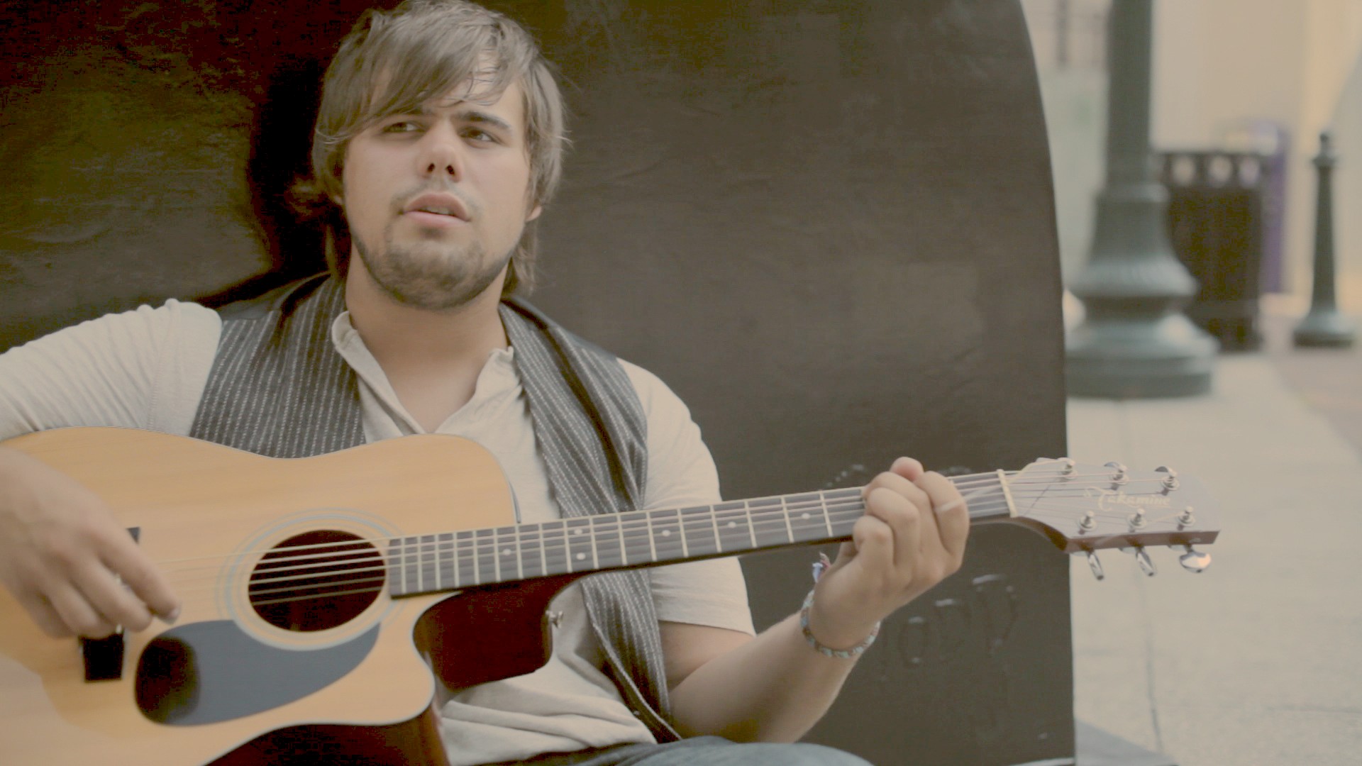
- A Faded Film LookThe look for this post is one I worked up for fun a while back when I was working on a freelance piece. I didn't end up using the look (I cooked it up just for fun; I was only...continue reading
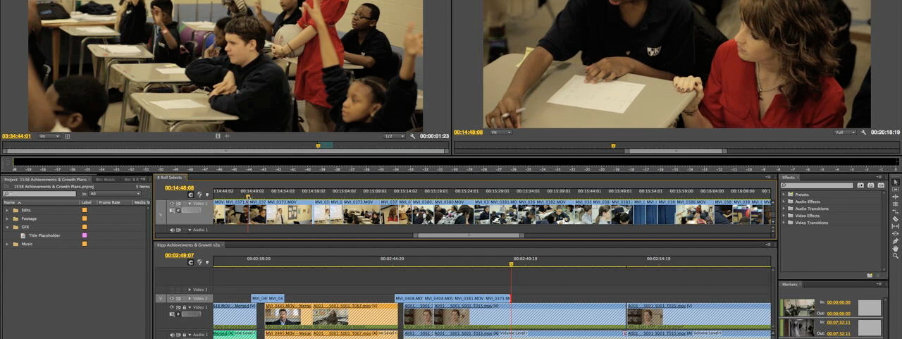
- A Post Production Project: Start to FinishI recently completed a project at my full-time job for KIPP Academy Nashville. I led the project from the initial client meeting to the planning to the shoot to post production, and it was wonderful working with a client that...continue reading
- Colorist Tip #47 – The LightboxUse a "lightbox" to see consistency, progression of a grade over time, and to pick out problem shots. The lightbox can give you a (very useful) 10,000 ft. view of the project you're working on. Wow! It's been a long time...continue reading
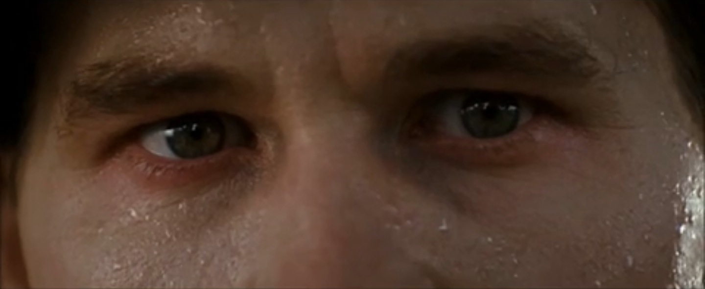
- Contrast is King – Part 3We've discussed contrast in an image, and how it affects perceived sharpness and mood. In the last post we discussed contrast between images in editing and how to use that, as well as changes and juxtaposition of pace, to create...continue reading
- Contrast is King – Part 2We looked over contrast in color grading in Part 1, and saw how it affects perceived sharpness and energy level. In this post, we'll dive into contrast in editing, but first, a quick reminder on the definition of contrast and...continue reading


