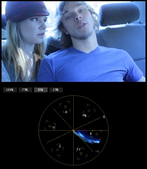
Most vectorscopes have a line that represents the color of skin. When balancing, use that line to get the skin tones right. The skin-tone line lies between red and yellow:

Scopes in FCP

Scopes in Apple Color
All skin tones, regardless of race, fall somewhere along (or very close to) this line. It has to do with the red blood and blood vessels that flow beneath our skin. The variations are mostly in saturation and luminance; there can be some hue variations, but they are minor, and will still fall near this line.
When you balance an image, skin tones are incredibly important to get correct. Using the skin tone line can help immensely to make your image neutral.

Original

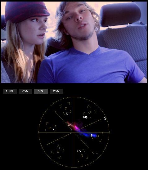
Close, but not quite.
The above is close, but if you look at the vectorscope, you can see that there’s nothing along the skin-tone line. The skin tones lean a little bit too much toward red and magenta.

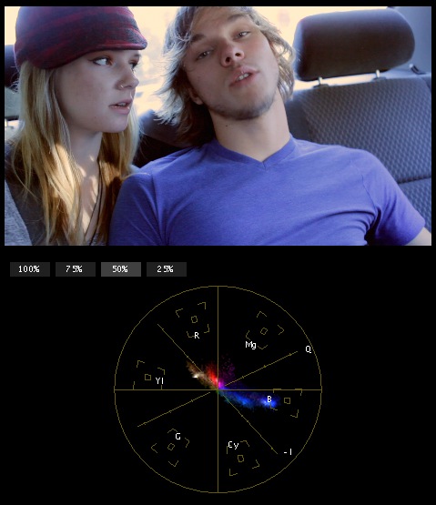
Much better.
This one looks much better, and you can see on the scopes where the skin-tone values lie across the line. As with most tools, the skin-tone line is a guideline, not a hard and fast rule. But, it will definitely help you get people that look right, not jaundiced or sickly or sunburnt.


